9.4 Determining what is normal
Reference ranges provide the values to which a health practitioner compares the test results to determine health status. Values which fall outside the reference range for a particular test are considered abnormal. For example, in the blood test above any sodium concentration below 135 mM or above 145 mM is outside the reference range. For some analytes, the reference range is defined as ‘less than’ or ‘greater than’ a certain value.
Reference ranges
Reference ranges (intervals) for some analytes are determined by a consensus of medical experts based on clinical outcome studies. For example, the American Diabetes Association has decreed (based on clinical studies) a fasting plasma glucose concentration of < 100 mg/dl as non-diabetic, 100–125 mg/dl as prediabetic and ≥ 126 mg/dl as diabetic.
However, most reference ranges are determined statistically based on data collected from a number of people and observing what appears to be ‘typical’ for them. Therefore, the sample should demographically match the population whose tests will be compared to the resultant reference range.
Let’s look at an example of how a reference range might be established. One diagnostic test for pulmonary function is forced expiratory volume (in litres) in 1 second (called FEV1). This is the volume of air you can force out of your lungs in 1 second and is measured by forcefully breathing into a mouthpiece connected to a spirometer (an instrument which records the volume of breath).
The data below represent FEV1 tests from a number of individuals, in this case 57 male, biomedical science students, ranked from lowest to highest. As these measurements have been obtained from 57 different individuals, the sample size is 57.
|
2.85 |
3.19 |
3.50 |
3.69 |
3.90 |
4.14 |
4.32 |
4.50 |
4.80 |
5.20 |
|
2.85 |
3.20 |
3.54 |
3.70 |
3.96 |
4.16 |
4.44 |
4.56 |
4.80 |
5.30 |
|
2.98 |
3.30 |
3.54 |
3.70 |
4.05 |
4.20 |
4.47 |
4.68 |
4.90 |
5.43 |
|
3.04 |
3.39 |
3.57 |
3.75 |
4.08 |
4.20 |
4.47 |
4.70 |
5.00 |
|
|
3.10 |
3.42 |
3.60 |
3.78 |
4.10 |
4.30 |
4.47 |
4.71 |
5.10 |
|
|
3.10 |
3.48 |
3.60 |
3.83 |
4.14 |
4.30 |
4.50 |
4.78 |
5.10 |
|
Even when data is organised, like this is, it can be difficult to interpret. If we want to use this data to determine a reference range than we need to understand the variation in the dataset and understand the central position of the data (measure of central tendency).
There are three ways to think about the central tendency or ‘average’ of a dataset. The most common way is by determining the mean of the data. This is the sum of all the values divided by the sample size.
Mean (sample) = x̅ = 
where
x̅ = mean of the sample
∑ = summation (add up)
xi = all of the values
n = sample size.
In the case of the FEV1 data, the mean is 4.06.
Rather than simply listing the data as above it can help to display the data points graphically.
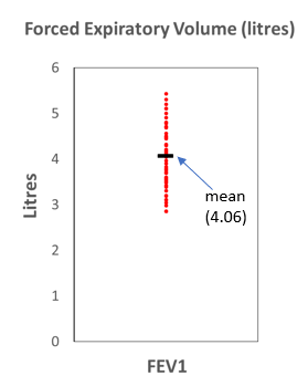
While this is somewhat useful it does not clearly indicate the other measures of central tendency: the median and mode. The median is the middle observation if the data are arranged in order. In the FEV1 data, the median data point is 4.10. The mode is the data point which occurs most often, in this case 4.47 occurs three times in the data.
These other measures of central tendency are useful particularly when compared to the mean as they provide an insight into how the data is distributed. For example, is the data spread evenly on either side of the mean or is most of the data bigger or smaller than the mean?
A common method for organising this kind of data to help answer these questions is to construct a histogram or frequency distribution table. A frequency distribution is an organised tabulation of the number of individuals in each category on the scale of measurement.
The following table shows the possible ranges of values for FEV1 in the left column and the number of data points in that range in the right column.
|
Range |
Frequency |
|
2-2.5 |
0 |
|
2.5-3 |
3 |
|
3-3.5 |
10 |
|
3.5-4 |
13 |
|
4-4.5 |
17 |
|
4.5-5 |
9 |
|
5-5.5 |
5 |
|
5.5-6 |
0 |
To make it easier to interpret, this table can then be graphed as a histogram.
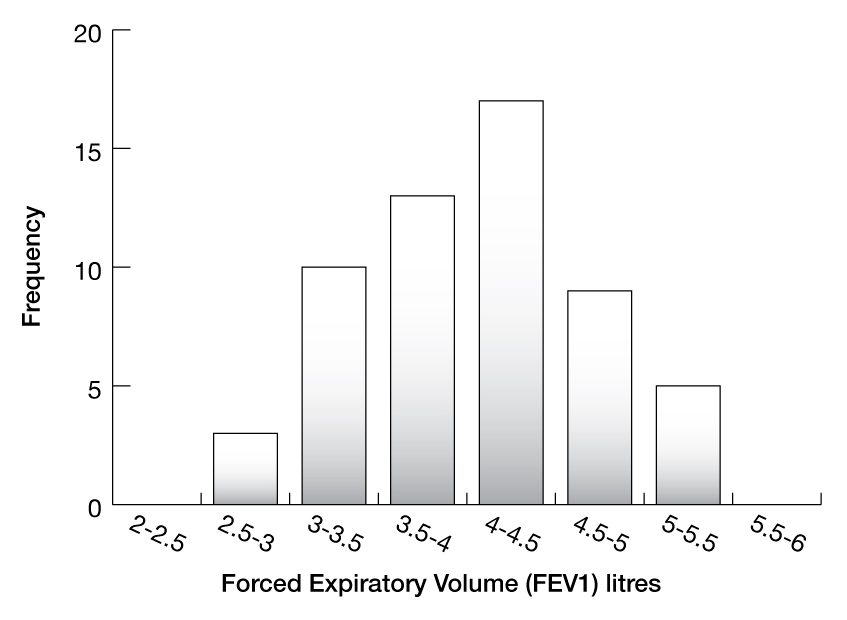
We can now observe some critical features of this data. The mean (4.06) is very close to the median (4.10) and importantly both are close to the mode, as most measurements fall into the 4–4.5 category. You can also see that roughly 50% of the data points fall on either side of the mean and that there is a single peak (mode).
These are the characteristics of a normal distribution. To understand how this distribution can be used to create reference ranges we first need to understand how to describe variations in data.
Describing data variation
The simplest way to look at variation is to look at the range (the minimum and maximum values). In this case the range of the data is 2.85–5.43 l. But it is important to note that the range does not provide any information as to how the data is arranged between these extreme values. The range is also likely to increase as sample size increases and can be sensitive to outliers.
The interquartile range is another measure of variability but based on dividing a dataset into quartiles. Quartiles divide a rank-ordered data set into four equal parts. The interquartile range is the difference between the upper quartile and lower quartile. In the set of data above this is 3.54–4.50. The interquartile range indicates the spread of the middle 50% of the data and has an advantage over the range in that it is less sensitive than range to sample size and outliers. It still has a disadvantage in that it does not use all of the information in the data and quite often the tail ends of the data are important.
Variance – often denoted as σ2 (population) or s2 (sample) – is a more useful measure of variation as it uses all of the data points. Variance is calculated as the ‘average’ squared deviation from the mean. That is, the sum of every measurement’s deviation from the mean divided by the number of measurements.
Variance (population) = σ2 = 
where
N = population size
µ = population mean
x = each measure.
Variance (sample) = s2 = 
where
n = sample size
x̅ = sample mean
x = each measure.
As most datasets involve a sample of the population rather than the entire population the sample variance will be used much more frequently. Even though variance uses all of the data it is measured in the original units squared and is therefore considerably affected by extreme values or outliers.
One thing you might be curious about is why square the deviations from the mean. The reason is that if you just add up the differences from the mean then the negatives will cancel the positives. A reasonable solution to this would be to use the absolute values of the differences (i.e. ignore the sign) but the problem here is that the averaging effect will still diminish the effect of extreme values.
The best way to solve this problem is to take the square root of the variance. This value is known as the standard deviation.
Standard deviation (population) = σ = 
Standard deviation (sample) = s = 
The standard deviation still provides a sense of how the data is spread out from the mean but unlike variance is in the same units as the measurement. Simply put, if the standard deviation is small, the data values are close to the mean value. If the standard deviation is high, the data values are widely spread out from the mean value.
Standard error of the mean
Standard deviation is useful when we want to indicate how widely scattered the measurements are. Though you will frequently see the standard error of the mean used to report variability in a set of data, a standard error is really a measure of how precise an estimate is. So, the standard error of the mean is an estimate of how precise the mean is.
A formal definition of the standard error of the mean is that it is the standard deviation of many sample means of the same sample size drawn from the same population.
But most of the time we only calculate one mean for a set of data, not multiple means. Therefore, unlike the standard deviation of the measurements, the standard error of the mean is an estimate rather than a measurement. We refer to it as an inferential rather than a descriptive statistic.
The standard error of the mean is calculated by the following formula:
Standard error of the mean = 
where
n = sample size
s = sample standard deviation.
This formula shows us that as n, the sample size, increases, the standard error of the mean decreases. This makes sense – the more data we have, the more precise will be our estimate of the mean. The standard error of the mean gets larger as the data exhibits more variability and standard deviation increases.
A real point of confusion is the nomenclature around the standard error of the mean. It is commonly (though imprecisely) shortened to just standard error. It is also abbreviated to SEM or sometimes SE. Standard deviation and standard error of the mean are often incorrectly interchanged.
The standard error is most useful as a means of calculating a confidence interval. For a large sample, a 95% confidence interval is obtained as the values 1.96 times the standard error of the mean either side of the mean.
Frequency distributions
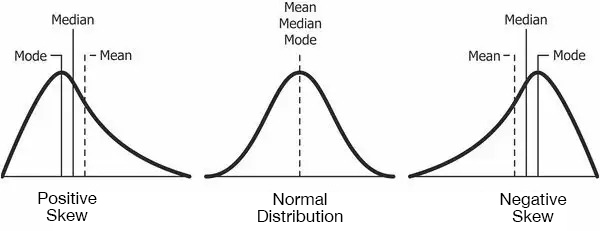
As we saw earlier, there are four important ways to describe frequency distributions: measures of central tendency (mean, median, mode); measures of dispersion (range, variance, standard deviation); symmetry/asymmetry (skewness); and the flatness or ‘peakedness’ of the distribution (kurtosis).
In a normal distribution, the mean, median and mode are all approximately the same. That is, there is symmetry about the centre with about 50% of values less than the mean and 50% greater than the mean. Importantly there is only one peak (mode). Data where the mean is greater than the mode and median is positively skewed and data where the mean is less than the median and mode is negatively skewed. Some data which follow a non-normal distribution may be bimodal or even multi-modal, which means it contains more than one peak.
A normal distribution is a common probability distribution. It is often referred to as a ‘bell curve’ and many datasets follow this distribution. In fact, as you increase the number of samples taken from a population, the more the resulting distribution will resemble a normal distribution.
This is a tenet of the central limit theorem, which states that given a sufficiently large sample size, the sampling distribution of the mean for a variable will approximate a normal distribution regardless of that variable’s distribution in the population.
What this means in practice is that you might perform a study where, for instance, you measure the FEV1 from a sample of individuals from the general population, and calculate the mean of that one sample. Now, imagine that you repeat the study many times and collect the same sample size for each. You then calculate the mean for each of these samples and plot them on a histogram. Given enough studies, the histogram will display a normal distribution of these sample means. This also means that the sample mean will start to approximate the population mean as sample size increases. So, in this way, we can use a sample distribution to make inferences about the population it is taken from.
But how large does the sample size have to be for the data to approximate a normal distribution? It depends on the shape of the variable’s distribution in the underlying population. The more the population distribution differs from being normal, the larger the sample size must be. Fortunately, many parameters will have an underlying normal distribution in the population and if not, care can be taken to sample from a normally distributed subset. In the case of FEV1 it would make sense to sample from either males or females as sampling from the entire population would result in a non-normal bimodal distribution. A rule of thumb agreed on by statisticians is that a sample size of 30 is sufficient for most variables.
So, the frequency distribution can be used to help determine a reference range for the data. That is, we can use the distribution to decide whether a particular measure can be considered ‘abnormal’.
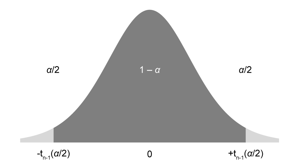
One property of normally distributed data is that 95% of values are approximately within two standard deviations of the mean. This can be best understood by looking at a standard normal distribution with a mean of 0 and a standard deviation of 1.
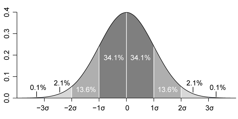
If you look at the area under the curve, the portion of the curve covered by the region 2 standard deviations either side of the mean is about 95%. You will also note that 68% of the curve is covered by the region 1 standard deviation either side of the mean and over 99% of the curve is covered by the region 3 standard deviations either side of the mean. This is useful to know because it tells us that any value is:
- likely to be within 1 standard deviation of the mean (68 out of 100)
- very likely to be within 2 standard deviations of the mean (95 out of 100)
- almost certain to be within 3 standard deviations of the mean (99 out of 100).
This value of ±2 standard deviations covering 95% of the standard normal distribution either side of the mean is known as the Z score. Note that ±2 is an approximation, and the correct number is really ±1.96.
One way to state this is:
p (–1.96 < Z < 1.96) = 0.95
That is, there is a 95% probability that a standard normal variable, Z, will fall between –1.96 and 1.96. This is known as the 95% confidence interval. But real sample data will not be the same as the standard normal distribution (mean of 0 and a standard deviation of 1), so how can we calculate this for other data?
We can use the following formula:
95% confidence interval = x̅ ± 1.96
where
n = sample size
x̅ = sample mean
s = sample standard deviation.
This works when the sample size is greater than 30 and the underlying population distribution is normal.
You will notice that this formula uses the standard error of the mean . This is because when we are calculating confidence intervals, we are really trying to indicate the uncertainty around the estimate of the mean.
Confidence intervals for smaller sample sizes
For sample sizes less than 30 (n < 30), the central limit theorem does not apply. So, another distribution, the t distribution, is used instead. The t distribution is like the standard normal distribution but takes a slightly different shape depending on the sample size. So, instead of ‘Z’ values, there are ‘t’ values for confidence intervals, which are larger for smaller samples, producing larger margins of error, because small samples are less precise.
The confidence interval estimate works in a similar way:
Confidence interval = x̅ ± t 
where
n = sample size
x̅ = sample mean
s = sample standard deviation
t = t-value.
We can look up the appropriate t-value (from a t-distribution table) based on the desired confidence interval. t-values are listed by degrees of freedom which are equal to n – 1 (see the next boffin section for more on this). Just as with large samples, the t distribution assumes that the outcome of interest is approximately normally distributed.
Example: 95% confidence intervals
Calculate the 95% confidence interval for serum creatine levels based on a study of 11 participants. The sample mean was 72 µM and the standard deviation was 8.5.
The first step is to look up the appropriate t-value. Since we are looking for a 95% confidence interval, this means that the tails outside this confidence interval will be 5% of the total area under the curve. Therefore, each tail will be 2.5%. This value, converted into a decimal, is known as α. In this case α = 0.025.
The next step is to determine the degrees of freedom (df). Since n = 11, the degrees of freedom are equal to 10 (n – 1).
You can then look up the appropriate t-value on a t-distribution table.
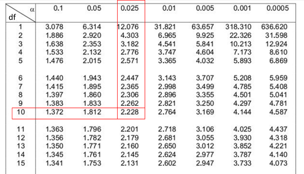
By cross-referencing α (0.025) and the degrees of freedom (10) we can find the t-value of 2.228 (Figure 9.8).
This can now be substituted into the equation:
95% confidence interval = x̅ ± t
95% confidence interval = 72 ± 2.228 
95% confidence interval = 66.3, 77.7
Reference ranges and false positives
In biomedicine a 95% confidence interval is most often used for determining a reference interval, in turn to decide whether a diagnostic result is atypical. But remember, 95% is an arbitrary value and given that the primary goal of diagnostic testing is to differentiate ‘healthy’ from ‘non-healthy’ individuals, other confidence levels can be selected.
One consequence of using this statistical approach for determining reference ranges for diagnostic testing is that even in a ‘healthy’ population, a single test result with a 95% reference range or confidence interval is outside the reference range in 5% (or 1 in 20) of cases. These cases are called false positives. The proportion of false positives may be even greater when the patient population is not closely matched to the control subjects with respect to age, sex, ethnic group, and other factors.

Why are degrees of freedom n – 1?
Degrees of freedom indicates how much independent information goes into a parameter estimate. This can be difficult to understand but a useful analogy is this:
Imagine a series of numbers 5, 4, 3, x where we know the mean is 5.
This means that x must equal 8. As you can see, the last number, x, has no freedom to vary. It is not an independent piece of information because it cannot be any other value. Estimating a parameter such as the mean imposes a constraint on the freedom to vary. The last value and the mean are entirely dependent on each other. So, when calculating the distribution of the t statistic, which is dependent on the sample mean, the degrees of freedom (df) are equal to the sample size minus 1 (n-1).
Sample bias
Sometimes other factors can influence the frequency distribution of an analyte and then the reference range used for a patient must consider that factor (e.g. age, sex). A clear indicator that there might be some sort of sample bias is a non-normal distribution.
With our example of FEV1 measurements in male biomedical students, a negative skew may result if we included in our sample group another 10 students who were all endurance athletes who had atypically high pulmonary capacity. Therefore, care needs to be taken to avoid sample bias when selecting individuals from a population. The resulting reference range will only be applicable to the cohort used to generate it.
A bimodal distribution might indicate some other factor that needs to be considered. For example, if we measured FEV1 for 57 male and 57 female biomedical students, it is likely we would end up with a bimodal distribution just due to inherent physiological differences between males and females. It would be more appropriate to separate the data by sex and derive male- and female-specific reference ranges.
