19 Sketching graphs from words

Transforming words to visuals representations can help build intuition.
One way to build intuition about how to read graphs and interpret the visual information presented is to practice transforming relationships, that are expressed in words, into anticipated visual representations.
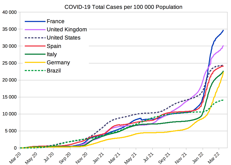
Traut, CC BY-SA 4.0, via Wikimedia Commons
Here we have a graph of Covid-19 cases per 100,000 people between March 2020 and March 2022 across several nations. You can see how, even with this quite complex graph, just how difficult it would be to convey this same information meaningfully using only words or a data table. Sketching helps!
Let’s have a go at sketching our own.
Picking strawberries

|
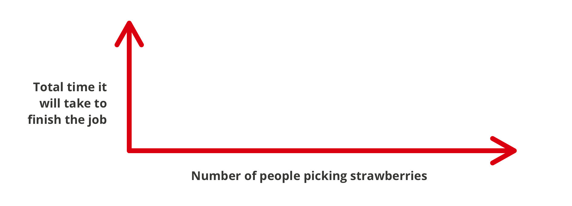
Imagine you have a field of strawberries ready for harvest. Create a graph of how long it will take to finish harvesting the entire field, depending on how many people you have helping you pick the strawberries. Tip: Consider using ‘Total time it will take to finish the job’ as the vertical axis and ‘Number of people picking strawberries’ on the horizontal axis. |
Once you’ve had a go, you can look at the following video (YouTube).
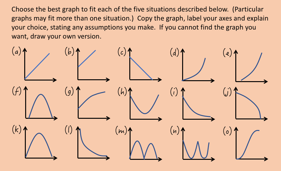
Problem Solving
The following problems ask you to anticipate how the relationships might appear on a scatterplot from the worded descriptions given. You’ll need to refer to the image below as you go.
Statistics and society
Visual information is often used to report on sociological trends and issues. These can be powerful tools for investigation, comparison and discovery.
Data exploration
For example, take a look at the online Google Visualisation application. You can use the left hand menu to change the two variables. You could, for example, select:
- On the x-axis: proportion of seats held by women in national parliaments (this is down the bottom under Social Development)
- On the y-axis: primary education, pupils (% female). This is in the Education category.
Take a look at the video if you get stuck at this point.
You can then use the slider to see how the scatterplot changes over time. Try choosing Australia and one other country (you can select them in the check box on the left to help you see) and compare them in two different years. For example:
In 1995, Australia had a higher percentage of female pupils but a lower percentage of women in parliament, then in 2005 they still had a higher percentage of female pupils, but now had a higher percentage of women in parliament.
Acknowledgement
The problems presented under the headings Picking strawberries and Problem Solving have been adapted from The Language of Functions and Graphs (1985) by Shell Center for Mathematical Education (this version modified by Deakin University and licensed under CC BY NC 4.0 with permission from Shell Centre for Mathematical Education).
