Statistical Modelling for Business Analytics
Yang Yang
Learning Objectives
By the end of this chapter, you will be able to:
LO1 Know the distinction between cases and variables in datasets.
LO2 Distinguish different types of data including nominal, ordinal, continuous and discrete variables.
LO3 Recognise that different graphs and statistics are effective for visualising and describing the distributions of different types of data.
LO4 Understand that common discrete and continuous distributions are useful for modelling various real-world phenomena.
LO5 Measure the strength of the linear relationship between two continuous variables by the correlation coefficients.
4 Statistics in business
Knowledge of statistics is essential for gaining insights into a company’s business operations, customer behaviour, market dynamics and the industry in which it competes. Business statistics is a systematic process of collecting data, conducting analysis, interpreting results and presenting visualisations. Utilising various statistical methods and techniques, management teams can make informed decisions to help companies remain competitive and adaptable in an increasingly data-driven business landscape. To better understand these fundamental concepts, let’s explore an example that illustrates their real-world application.
This chapter focuses on foundational statistical methods relevant to business analytics. More advanced topics, such as non-parametric tests and time series analysis, are excluded to maintain accessibility but are suggested for further study. While advanced inference procedures are valuable in certain applications, they are beyond the scope of this introductory text. In addition, Bayesian approaches are increasingly popular in data-driven decision-making, especially in modern analytics. This chapter introduces foundational frequentist methods. Readers interested in these topics are referred to more advanced texts and the additional resources listed at the end of this chapter.
Statistical tools play a crucial role across different industries and business applications. This chapter utilises real estate scenarios to demonstrate concepts such as random variables, probability distributions, and regression analysis. These real-world examples aim to showcase the practical impact and effectiveness of statistics. Let us begin with the following introduction example.
Leveraging statistics for data-driven decisions in Sydney’s rental market
Consider the scenario of a real estate agent navigating Sydney’s rental market. With various factors influencing property demand such as dwelling types, location, and economic conditions making informed business decisions requires analysing complex data patterns. This is where statistics and statistical analysis tools play a crucial role.
By examining Figure 4.1, we can see how housing supply, market trends, and economic factors shape rental pricing and customer demand. This Local Government Housing Kit published by DCJ Statistics (2024), provides valuable insights into housing supply, market distributions, and the economic status of customers in the Greater Sydney local government area (LGA) and the rest of NSW. However, effectively interpreting this data requires a solid grasp of statistical principles. Let’s examine this example to understand how statistical concepts help make sense of complex data.
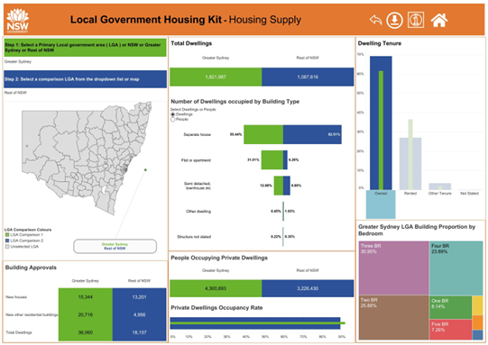
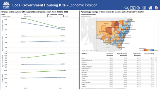
Figure 4.1: Housing supply and the economic positions in Greater Sydney LGA and the rest of NSW. The data and visualisations are downloaded from the Local Government Housing Kit provided by the NSW Government.
Alternative Text for Figure 4.1 (a) (b)
This image contains two sets of data visualisations comparing housing supply and economic positions in Greater Sydney Local Government Areas (LGAs) and the rest of New South Wales (NSW). The visualisations are sourced from the Local Government Housing Kit provided by the NSW Government.
-
Left (Figure a: Housing Supply): Displays total dwellings, dwelling types, building approvals, and occupancy rates for Greater Sydney and the rest of NSW. Includes a map of NSW with selectable LGAs, bar charts showing dwelling tenure types (owned, rented, and others) and illustrating the distribution of dwellings by the number of bedrooms.
-
Right (Figure b: Economic Position): Presents economic trends from 2016 to 2021, highlighting changes in household income groups. Includes a line graph showing income cohort trends, a heat map depicting the percentage change in household incomes by LGA, and a data table summarising these changes.
This chapter will introduce theories and applications of statistics, focusing on their applications in analysing real-world business datasets.
4.1 Data and statistics
Data is the collection of observations or measurements that can provide quantitative and qualitative information to assist decision-making. It is the fundamental input in statistics to produce meaningful statistical studies. Data is the foundation for providing evidence to assist management in making informed decisions.
4.1.1 Types of data
There are two broad types of data in the business environment: the numerical data providing quantitative information and the categorical data presenting qualitative responses.
Numerical data is most often either continuous in nature or can only take certain discrete values. The discrete data is used for counting occurrences of separate events and hence contains distinct integer values. The continuous data can take any value within a range, yielding an infinite number of possible measurements. Continuous data is measured, not counted, and can represent any value, including decimals and fractions, depending on the precision of the measurement tool.
Categorical data is used to classify individuals, items or events based on shared characteristics. Depending on whether a natural order or ranking exists in the measurement levels, categorical data can be further broken down into nominal and ordinal. The nominal data are labels or categories without any inherent order. The frequencies of observations that fall into each labelled category are typically analysed to provide information about the spread of the data. The ordinal data often consists of rankings or ratings of objects based on attributes. The frequencies of data in categories, as well as the ordering of individual observations, are all important for ordinal data.
Figure 4.2 illustrates the four types of data covered in this chapter.
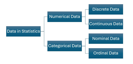
Alternative Text for Figure 4.2
A hierarchical diagram illustrating the types of data in statistics. The diagram starts with “Data in Statistics” and branches into two main categories: Numerical Data and Categorical Data.
- Numerical Data further divides into Discrete Data and Continuous Data.
- Categorical Data branches into Nominal Data and Ordinal Data.
Understanding data types from Figure 4.1 – Sydney’s Rental Market
Using the dataset described in Figure 4.1, we illustrate the four data types as follows:
- Discrete data
Number of bedrooms in rental houses is a discrete variable whose values are integer counts starting from one. Fractions do not make sense in this case. Residential houses typically do not have designs with “zero bedrooms”.
- Continuous data
Living space is a continuous variable that is usually reported in square metres (m2). Living space can be measured to any level of precision depending on the measurement tools used, e.g., 68.1 m2 and 68.105 m2.
- Nominal data
Building type is a nominal variable consisting of several categories, e.g., apartment, detached house, townhouse, unit, etc.
- Ordinal data
Property condition is an ordinal variable describing a ranked order of property quality, with possible categories like “Poor”, “Fair”, “Good” and “Excellent”. Note that the variable does not quantify how much better one level is compared to another.
4.1.2 Descriptive statistics
Real-world data analysis often begins by computing statistics for the collected data. Before delving into the computation of statistics, it is worthwhile to distinguish between cases and variables.
A case is a subject or individual from whom data has been collected. For example, a 3-bedroom apartment in Sydney’s CBD can be considered a case in a dataset collected by real estate agents.
In contrast,
A variable is any characteristic measured on the case. Following the discussion of real estate data, a variable can be defined as the monthly rent for all 3-bedroom apartments in Sydney.
It is easily noticed that real-world data often has significant variations: not all 3-bedroom apartments in Sydney are rented out at the same price! In statistics, data is considered a mixture of “signal and noise” or “patterns and variations”.
Descriptive statistics is a key branch of statistics that focuses on summarising and describing the main features of a dataset. By studying descriptive statistics, one can gain insights into the characteristics of the current dataset. Common descriptive statistics include measures of central tendency (such as mode, mean and median) and measures of dispersion (such as range, variance and standard deviation).
Consider a variable X consisting of n observations. The common measures of central tendency include:
- The sample mean, denoted by x̅, is the average of the n observations:

where the lower case xi denotes the ith observation of the random variable X.
Mean values can be computed for continuous or discrete numerical variables. However, this measure of central tendency can be easily affected by outliers, which are observations that are considerably larger or smaller than the rest of the data points in the sample.
- The median is the middle observation (the average of two middle observations if n is an even number) when the data are arranged in increasing order. Medians are used with ordinal, continuous or discrete data. An advantage of the median measure is being immune to outliers or data skewness.
- The mode is the most common observation of a variable. Mode is often used with nominal data and discrete numerical data. However, the mode should not be used as the only measure of central tendency for a given dataset.
Commonly used measures of dispersion include:
- The range is the difference between the highest and lowest observations:
Range=Maximum-Minimum
- The sample variance, denoted by s2, measures squared differences from the mean:

- The sample standard deviation, denoted by s, is the square root of the variance:

Both variance and standard deviation measure how spread out the observations in a given dataset are.
- The quartiles are the values that divide a collection of sorted numerical data into quarters. The difference between the 3rd quartile (Q3) and the 1st quartile (Q1) is denoted as the interquartile range (IQR):
IQR = Q3 − Q1
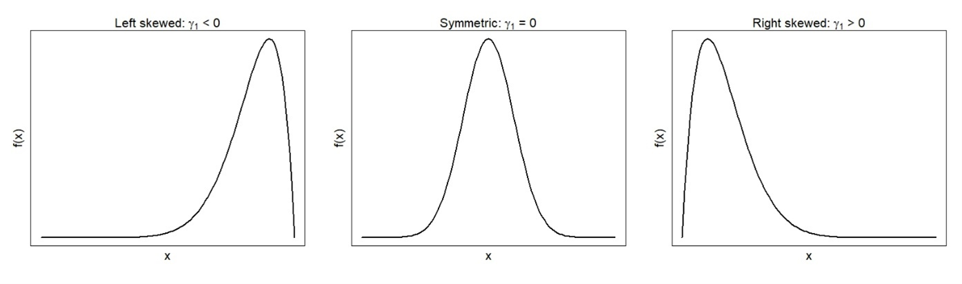
- The coefficient of skewness (γ1) measures asymmetry in the distribution, with acceptable values falling between −3 and 3. Distributions with positive coefficients of skewness (a.k.a. positively skewed distributions) have longer tails on the right side. Mean and median values will be greater than the mode. In contrast, negative coefficients of skewness correspond to negatively skewed distributions with longer left tails. The mean and median of negatively skewed distributions are less than the mode.
- The coefficient of kurtosis (γ2) is a measure that quantifies a probability distribution’s tailedness. Its definition ensures that for the Normal distribution (to be introduced in Section 4.2), the coefficient of kurtosis is zero. The coefficient of kurtosis is often used to identify outliers in the distribution: kurtosis greater than 3 indicates a leptokurtic distribution with potential large outliers.
Which central tendency measure should be used to describe a dataset?
- Using the mean is appropriate when data is not skewed or affected by outliers.
- Use the median when the data contains outliers or is ordinal in nature.
- Use the mode when the data is nominal.
- The best approach is to use all three together to capture and represent the central tendency of the data set from three perspectives.
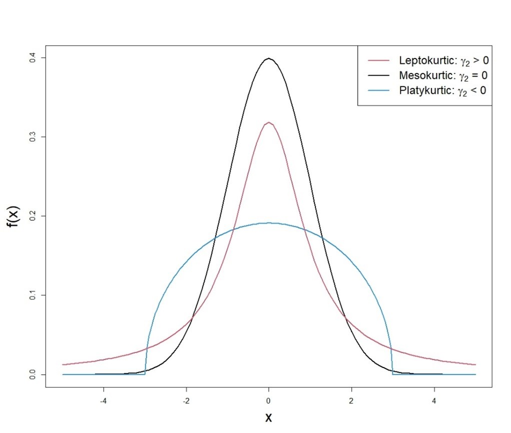
Alternative Text for Figure 4.4
A line graph illustrating three types of distributions based on kurtosis, which describes the shape of a probability distribution in terms of how peaked or flat it is. The graph includes three curves:
- Leptokurtic (Tall and Thin) – Represented by the black curve, this distribution has a high peak and long tails, indicating a kurtosis value greater than three.
- Mesokurtic (Normal Shape) – Shown by the red curve, this distribution has a moderate peak and tails, representing the normal distribution with a kurtosis value of three.
- Platykurtic (Flat and Broad) – Depicted by the blue curve, this distribution has a low peak and short tails, indicating a kurtosis value less than three.
The x-axis represents the data values, while the y-axis represents the probability density function. A legend in the top right corner labels the three types of kurtosis. The figure highlights how kurtosis affects the shape of a distribution.
- Standard deviation is more commonly used because it uses all of the data. However, it is sensitive to outliers.
- IQR is a more reliable measure of spread for skewed data or data with extreme values because it is resistant to outliers.
|
Shape |
Measure of centre |
Measure of spread |
|
Symmetrical |
Mean |
Standard deviation |
|
Skewed/outliers |
Mean and Median |
SD and IQR |
Graphical representations (such as histograms, bar charts, box plots, scatter plots, etc.) are also considered important tools for describing datasets. Different types of data require specific graphical tools to effectively highlight their features. Recall the introduction example of real estate agents investigating rental properties in Sydney. Given the city’s vast size and diverse range of properties, capturing their unique features through text and numbers alone is highly challenging. To address this, various graphical tools can be used to visualise the characteristics of residential properties, as demonstrated in the following example.
Exploring Sydney’s property market: Insights from web-scraped data
A dataset about residential property information in Sydney was collected by Alex Lau in 2021 through web scraping from the Australian leading digital property portal Domain.com.au. The dataset covers 11,160 property sale transactions in the Greater Sydney LGA between 2016 and 2021. There are eight variables that describe the characteristics of properties, such as sale price, number of bedrooms, number of bathrooms and property size in square metres. Additionally, there are eight variables related to the suburb where the property is located, including the suburb’s population and median income.
The complete dataset can be downloaded from Kaggle (2021). This example focuses on apartments, houses and townhouses with less than 10 bedrooms and 1000 m2 property size and uses the appropriate graphical tools to visualise the following variables.
- Number of bedrooms as a discrete variable with a small number of observed values can be visualised by a bar chart, as shown in Figure 4.5. It can be seen that the plot has a longer tail on the right side, indicating a right-skewed distribution. Properties with 4 bedrooms are the most common in the dataset, hence mode = 4 for the “number of bedrooms” variable. Median = 5 for the 9 discrete values considered. The mean value is located between the two highest bars (i.e., 3-bedroom and 4-bedroom bars) and turns out to equal 3.69.

Alternative Text for Figure 4.5
A bar chart showing the distribution of the number of bedrooms in selected residential properties in Sydney. The x-axis represents the number of bedrooms, ranging from 1 to 9, while the y-axis represents frequency, indicating how many properties have each bedroom count.
- The most common properties have 4 bedrooms, followed by 3-bedroom properties.
- Properties with 5 bedrooms are less frequent but still notable.
- Fewer properties have 1, 2, 6, 7, 8, or 9 bedrooms, with 8 and 9-bedroom properties being the least common.
The chart highlights the typical bedroom distribution in Sydney’s residential properties, showing that 3- and 4-bedroom homes are the most prevalent.
- Property size is a continuous variable that can be best visualised by a histogram or a box plot, as shown in Figure 4.6. The distribution of property size is roughly symmetrical with a mean size of 551 m2 and a median size of 575 m2. There are two outliers in the left tail of the distribution as indicated by the “circles” in the box plot.
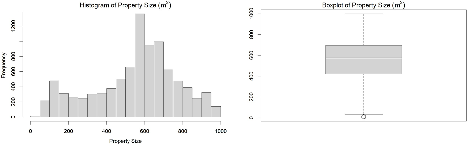
Alternative Text for Figure 4.6
A figure consisting of two graphs representing the distribution of property sizes for selected residential properties in Sydney.
- Left: Histogram of Property Size – A bar chart displaying the frequency distribution of property sizes. The x-axis represents property size in square meters, while the y-axis represents frequency. The histogram shows that most properties have sizes clustered around 600 square meters, with a spread ranging from smaller to larger properties.
- Right: Boxplot of Property Size – A boxplot summarising the spread and central tendency of property sizes. The box represents the interquartile range (middle 50% of the data), the horizontal line inside the box indicates the median, and the whiskers extend to the minimum and maximum values within a defined range. A few outliers are visible below the lower whisker, suggesting some properties have significantly smaller sizes than the majority.
These visualisations provide insight into the distribution and variability of residential property sizes in Sydney.
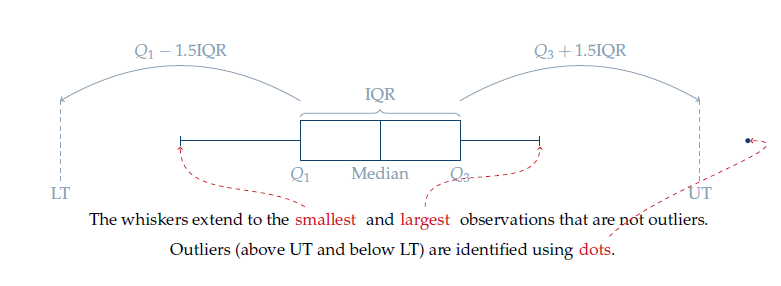
The following diagram 4.7 illustrates how outliers beyond the upper limit (UT) and lower limit (LT) are determined in the box plot. This “1.5 IQR rule” was developed by statistician John W. Tukey in 1969.
- Property type is a nominal variable that can be visualised by a Pareto chart as shown in Figure 4.8. A Pareto chart combines a bar chart arranged in a decreasing frequency with a line plot tracking the cumulative percentage of the categories from left to right.
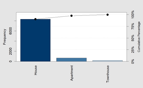
Alternative Text for Figure 4.8
A Pareto chart displaying the distribution of property types for selected residential properties in Sydney. The x-axis represents three property types: House, Apartment, and Townhouse. The left y-axis indicates the frequency of each property type, while the right y-axis shows the cumulative percentage.
- Houses have the highest frequency, significantly outnumbering other property types.
- Apartments appear in much smaller numbers.
- Townhouses have the lowest frequency among the three property types.
- A cumulative percentage line with black dots is plotted above the bars, showing that houses make up the majority of residential properties in the dataset.
This visualisation highlights the predominant property type in Sydney, emphasising the dominance of houses over apartments and townhouses.
Real-world data often include missing values. For instance, property transaction records may lack sale prices due to confidentiality agreements between buyers and sellers. Depending on the context and the extent of missing data, the most common approaches are either excluding incomplete cases or imputing missing values using estimates such as the mean or median. Advanced analytics tools such as Python or R provide libraries for automating these processes, such as scikit-learn for machine learning or pandas for data cleaning. Details of missing value handling techniques are omitted to avoid overwhelming the readers.
4.1.3 Inferential statistics
Inferential statistics provide evidence for making generalisations about the entire population based on sampled data. The “inference” refers to extending findings from the collected datasets to the population from which the samples were drawn.
In the real world, studying every individual in a population is often impractical or impossible due to time and budget constraints in sample collection. Inferential statistics help users to draw conclusions and make predictions about populations by studying a small sample of representative data.
More details about the techniques used for making statistical inferences will be introduced in Section 4.3.
Table 4.1 summarises the main differences between descriptive and inferential statistics, highlighting their respective purposes, representations and commonly used techniques.
| Descriptive Statistics | Inferential Statistics | |
| Purpose | Summarises and describes characteristics of a specific dataset | Generalises findings to make inferences about the entire population |
| Representation | Represents characteristics within the current dataset | Represents characteristics of the entire population |
| Techniques | Measures of central tendency and spread, graphical tools | Confidence intervals and regression analysis |
4.2 Common probability distributions
Real-world data has variations, with sources of variation including the inherent differences in the objects being observed and measurement errors. Because of the uncertainty, data is collected in practice by following certain systematic processes or rigorous experiments. A random variable is a numerical value associated with each outcome of a process or experiment. Referring to the real estate agent example, would descriptive statistics and graphical tools be sufficient to handle all properties and accommodate every existing and potential customer?
Estimating living space: The role of measurement precision in real estate
Referring to the previous real estate dataset, the living space of a rental property can be considered a random variable that both agents and customers find significant. However, even the most experienced agents cannot accurately determine a house’s total living space by visual inspection. Laser measurement tools[1] need to be used, and proper procedures should be followed to ensure precise results. It is nearly impossible to find two houses with identical living areas when the values are measured to two decimal points. A statistical tool that allows for generalising findings from a specific dataset to a larger population would be highly valuable in this case. It enables real estate agents to draw meaningful insights about rental properties in Sydney despite the city’s vast size and diverse housing market.
The large volume of data in practice means observations cannot be effectively analysed on an individual basis. What’s more, inferential statistics aims to generalise findings from the current dataset to the entire population with an infinite number of unobserved objects. Statisticians apply probability theory to analyse random variables and utilise probability distributions to standardise their findings. A probability distribution is a statistical function that describes all the possible values and likelihoods that a random variable can take within a given range. Commonly used probability distributions for discrete and continuous variables are introduced in this section.
4.2.1 Discrete probability distributions
The Binomial and Poisson distributions are the two commonly used probability distributions for dealing with discrete random variables that count the occurrences of events. Many other discrete probability distributions are extensions of these two distributions.
4.2.1.1 Binomial distribution
Consider a sequence of n independent trials, each resulting in either success or failure with fixed probabilities. Let X denote the count of “successes” in this experiment and p denote the probability of success. Then X follows a Binomial distribution denoted by X ∼ B (n, p), for which the probability mass function is:

where  is a Binomial coefficient. Key features of the Binomial distribution include:
- There is a fixed number n of trials.
- Each of the n trials is independent.
- Each trial can be classified as a “success” or a “failure”.
- The probability of success, p, remains constant across all trials.
The mean and variance of the Binomially distributed X are given by:

Note that the E(X) and Var(X) are used to represent the population mean and variance of X, respectively. These notations for population parameters will be used throughout this section. The population mean and variance reflect the “true” characteristics of the entire population and do not depend on any specific dataset. In contrast, the sample mean ( ) and sample variance (
 ) introduced in Section 4.1 only describe features of a given dataset. The following examples illustrate the difference.
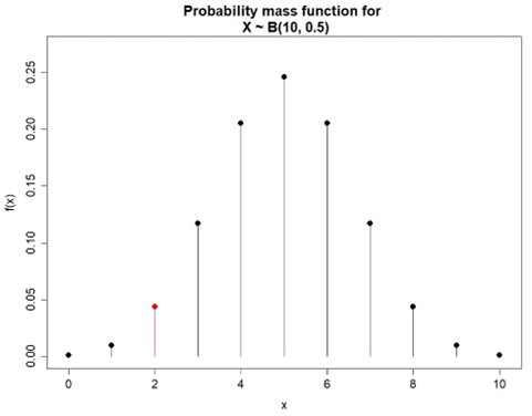
Coin flip
A fair coin is flipped 10 times. Define X as the number of heads observed in 10 flips. What is the chance of observing P(X=2), i.e., the probability of observing 2 heads?
X ∼ B(10,0.5) because it satisfies the following conditions of the Binomial setting:
- There is a fixed number of trials (n=10).The trials are independent.
- The result of one flip does not influence the result of another.
- A coin flip results in two possible outcomes: heads or tails. The heads are classified as successes in this experiment.
- The probability of success is constant for each flip at p=0.5 since a fair coin is flipped.
The probability of observing 2 heads in 10 flips is

Figure 4.9 illustrates the probability mass function for this experiment. The mean and variance for the X ∼ B(10,0.5) can be computed as
E(X) = 10×0.5 = 5,
Var(X) = 10×0.5×(1-0.5) = 2.5
where the E(X) = 5 means that the expected number of heads in a fixed number of 10 flips of a fair coin is 5. This means one would expect to observe an average of 5 heads over many repeated experiments under the same conditions.
4.2.1.2 Poisson distribution
Consider events that occur independently at a fixed average rate λ > 0. Let X be the count of the number of events over a fixed time interval. The random variable X then follows a Poisson distribution, X ∼ P(λ), for which the probability mass function is:

Where e ≈ 2.7183 is the Euler number. The Poisson distribution is named after the French mathematician Simeon-Denis Poisson and is useful for modelling a wide range of real-world phenomena. Some examples include:
- The number of customer service calls at a call centre in the next hour.
- The number of claims received by an insurance company in a month.
- The number of patients arriving in an emergency room over the period of an hour.
- The number of server failures or technical issues reported per week by an IT company.
Key features of the Poisson distribution include:
- The events occur independently.
- The average rate of events occurring is fixed at λ.
- The events are observed over a fixed interval.
The mean and variance of X ∼ P(λ) are given by:

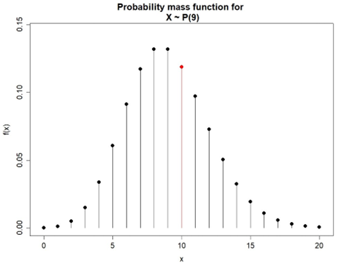
Predicting customer visits: A probability approach in real estate
Suppose a real estate agent preparing a house open for inspection believes that, on average, 3 customers arrive every 10 minutes. What is the probability that in the next 30 minutes, 10 customers will arrive?
Let X be the number of customers arriving in a 30-minute period. X follows the Poisson distribution with λ = 3×3 = 9 customers per 30 minutes.

Therefore, there is about an 11.86% chance that 10 customers will arrive within the next 30 minutes. Figure 4.10 illustrates the probability mass function for this example.
There are other discrete distributions that are linked to the Binomial and Poisson distributions introduced above. Here are some examples:
- In analogy to the Binomial distribution, a Geometric distribution arises when the number of failures is counted before observing the first success.
- A Negative Binomial distribution arises when the Geometric distribution is extended to observe the rth success.
- A sum of a number of independent and identically distributed Poisson random variables yields Compound Poisson distribution.
Choosing the appropriate probability distribution depends on the context of the data and the problem being solved.
4.2.2 Continuous probability distributions
When data arises because of measurements or observations of continuous processes, continuous distributions are needed to model such variables. Two most popular continuous probability distributions are introduced in this section.
4.2.2.1 Exponential distribution
Consider events that occur over a period of time where the number of occurrences following a Poisson distribution have a fixed rate λ. Let X denote the length of time until the next event occurs. Then the random variable X follows an Exponential distribution with parameter λ, denoted by X ∼ Exp(λ).The probability density function (PDF) of X is given by:

The mean and variance of X ∼ Exp(λ) are given by

Modelling customer arrivals: Poisson distribution in retail operations
Suppose that an average of 3 customers every 10 minutes arrive at a shop in accordance with a Poisson distribution. What is the probability of there being a 5-minute break (i.e., no customers arriving) so the shop owner can have a cup of tea? Given that it has been 5 minutes since the last customer arrived, what is the probability of there being a further 5-minute break?
Let X be the time until the next customer arrives. Let Y denote the number of customers that arrive within a x-minute period. According to the question, Y is a Poisson distributed random variable with a rate parameter  . It can be seen that:

where F(x) is the cumulative density function of X. Taking the first derivative of F(x) yields the probability density function of x given by:

This is an exponential distribution with λ=0.3. The probability of no customers arriving in the next 5 minutes is:

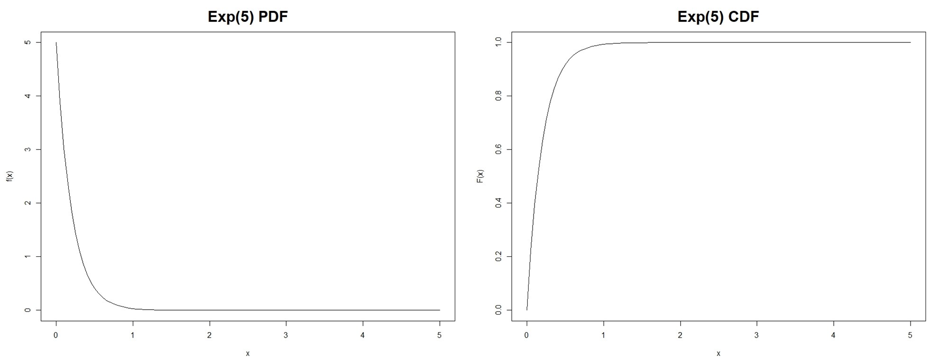
Thus, there is about a 22% probability of at least a 5-minute break. Given that it has been 5 minutes since the last customer arrived, the probability of there being a further 5-minute break is given by:

The fact that the shop owner has already waited 5 minutes for a customer does not change the probability that there will be another 5 minutes without a customer.
The memoryless property demonstrated in this example is a key feature of the Exponential distribution. That is, the probability of an event occurring in the next time interval does not depend on how much time has already passed, i.e.,

The Exponential distribution has a wide range of applications in business:
- Modelling customer service processes, such as the time between customer arrivals or the service time at a counter.
- Estimating the time until failure of machines, equipment or systems.
- Modelling the time between restocking.
- Analysing the time between events in risk scenarios, such as a borrower defaults on a loan.
- Estimating the time until a response to an advertisement or marketing campaign is received.
4.2.2.2 Normal distribution
The most common continuous distribution is the Normal distribution, often referred to as the Gaussian distribution in honour of mathematician Carl Friedrich Gauss. Let X be a random variable that is Normally distributed with mean μ and variance σ2, i.e., X ∼ N(μ, σ2). The probability density function of X is given by:
![\begin{align*} f(x)=\frac{1}{\sqrt{2\pi \sigma ^{2}}}\text{exp}\left[ -\frac{(x-\mu)^{2}}{2\sigma ^{2}}\right] , \quad -\infty <x<\infty \end{align*}](https://oercollective.caul.edu.au/app/uploads/quicklatex/quicklatex.com-694e5008a0024185fbc278ae90330852_l3.png "Rendered by QuickLaTeX.com")
The mean μ controls the location of the curve along the X-axis, whereas the variance σ2 controls the spread of the distribution about the mean, as illustrated in Figure 4.12.
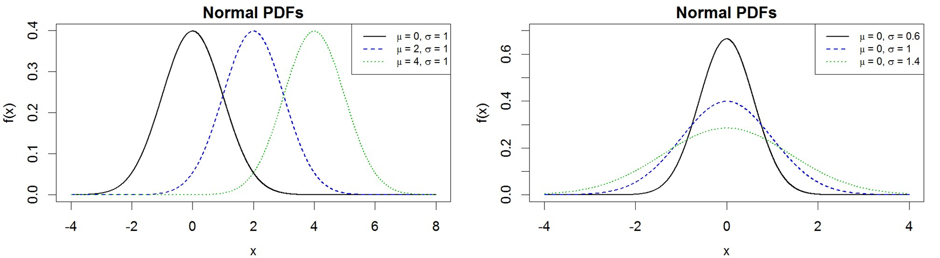
When μ=0 and σ2=1, X becomes the Standard Normal distribution that is often denoted by Z ∼ N(0, 1). The Standard Normal distribution is useful for computing probabilities using the standardisation of Normally distributed variable X ∼ N(μ, σ) given by:

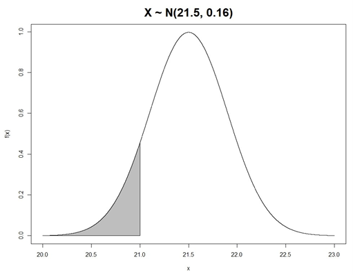
Assessing chocolate weight variability using normal distribution
A chocolate maker produces a certain type of chocolate with a nominal weight of 21 grams. Assume that the distribution of weights is actually N(21.5, 0.16). Let X denote the weight of a single chocolate selected randomly from the production process. What is the probability that this selected chocolate weighs less than 21 grams, i.e., P(X < 21)? It is known that X ∼ N(21.5, 0.16) according to the description. Using the standardisation of Normally distributed variables, the required probability of a randomly selected chocolate weighing less than nominal is given by:

Therefore, there is about a 39.58% chance that a randomly selected chocolate weighs less than 21 grams, as illustrated in Figure 4.13.
Other commonly used continuous probability distributions include:
- The Uniform distribution describes a situation where all outcomes within a given range are equally likely. This distribution is commonly used when there is no reason to favour one outcome over another or when data is distributed evenly.
- The Gamma distribution is often used for modelling skewed data that describe the time until a certain number of events occur. It is a generalisation of the exponential distribution, making it versatile in various contexts, such as reliability analysis, queuing systems and financial modelling.
4.3 Statistical inference
Data collected in the real world is always subject to random variation. Repeating a 10-trial coin-flipping experiment multiple times with the same coin will likely yield different numbers of heads. When estimating the parameters for a probability distribution, there is always a question to answer:
Which dataset contains the most accurate information about the population?
Statistical inference, as a process of analysing data with uncertainty and making conclusions about the parameters of the entire population, is the answer to this question.
Statistical inference provides a probable range for the true values of a population parameter after accounting for sample-to-sample variations (e.g., sample size, variation within the sample, differences across samples, etc.) of real-world datasets.
This section will introduce the most popular statistical inference techniques: confidence interval and regression analysis.
4.3.1 Confidence interval
Confidence intervals provide a range of values within which a population parameter of interest (e.g., mean or variance) is expected to be located. They are crucial for making informed decisions in business and scientific research. Suppose a population parameter θ is estimated based on a random sample x={X1, X2, …, Xn}. It is possible to determine two statistics, a(x) and b(x), based on the sample information such that:
P(a(x) < θ < b(x) = 100(1-α)% = C%
where 0 < α < 1 is the significance level parameter. The interval [a(x), b(x)] specifies a probable range for the population parameter θ at a C% confidence level, which is called a C% confidence interval for the population parameter θ.
The confidence interval reflects the variability in the data since both limits (i.e., a(x) and b(x)) are computed based on all observations x. The confidence interval does not mean that the population parameter θ will be contained within the range [a(x), b(x)]. Instead, if many random samples of size n were selected, then 100(1-α)% of them should contain θ. Alternatively, one can interpret the confidence interval as being 100(1-α)% confident that the population parameter θ lies somewhere within the range [a(x), b(x)].
The computation of confidence intervals relies on the probability distribution of a statistic (i.e., sampling distribution of statistics) estimating the population parameter of interest. Therefore, it is necessary to choose the appropriate computation equations for different datasets. When the sample size is sufficiently large, the following Central Limit Theorem applies to simplify the computation.

The Central Limit Theorem specifies that, as n → ∞, the sampling distribution of  follows a Normal distribution irrespective of the sampling distribution of the variable X. In practice, this theorem works reasonably well if n is greater than 30.
With the help of the Central Limit Theorem, a general (1-α)% confidence interval for the population mean parameter μ can be computed as:

where  is the (1-α/2)th quantile of the Standard Normal distribution. To use this general confidence interval equation, the sample size n and the population variance σ2 (or standard deviation
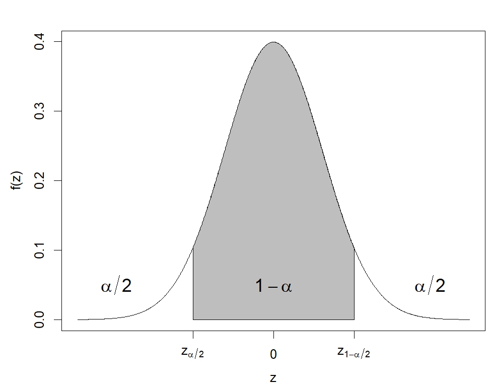
The following derivations explain the computation of this confidence interval.

It can be seen that the computed confidence interval corresponds to the central (1-α)% area in the Standard Normal distribution, as illustrated in Figure 4.14. Different values of α will lead to different values, and thus, the choice of α will reflect the width of the interval.
Estimating customer satisfaction: A 95% confidence interval analysis
A company surveyed 100 customers about a new product. The average rating was  (out of 10). It is assumed the population standard deviation σ = 0.6 for all ratings. Find a 95% confidence interval for the mean customer rating score.
For a 95% confidence interval, α = (1-0.95) = 0.05 and z1-α/2 = z0.975 = 1.96 using a statistical table or computation software. The 95% confidence interval for the mean customer rating score can be computed as:
![\begin{align*} \overline{x} \pm z_{1-\frac{\alpha}{2}}\frac{\sigma}{\sqrt{n}} & = 8.1 \pm 1.96\times \frac{0.6}{\sqrt{100}} \\ & = 8.1 \pm 0.1176 \\ & = [7.9824, \ 8.2176] \end{align*}](https://oercollective.caul.edu.au/app/uploads/quicklatex/quicklatex.com-438da831102db85aa35b913f56f3a569_l3.png "Rendered by QuickLaTeX.com")
Therefore, the company is 95% confident that the true mean rating score for this product lies between 7.9824 and 8.2176.
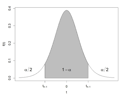
In practice, it is difficult to get a good estimate of the population parameter σ. In this case, a t-distribution is used to compute the confidence interval for the population mean as:

where s is the sample standard deviation introduced in Section 4.1 and  is the 1-α/2 quantile value from the Student’s t-distribution with n-1 degrees of freedom, as illustrated in Figure 4.15.
The t-distribution was introduced by English statistician William Sealy Gosset in 1908. At the time, Gosset worked for Guinness Breweries in England, which prevented their workers from disclosing confidential information after an employee was found to have leaked trade secrets of the brewery. For this reason, Gosset, who considered himself a student of statistics, published his work under the name “Student”. The t-distribution is a continuous distribution whose probability density function is symmetrical and analogous to that of the Normal distribution.
Estimating weekly sales: A confidence interval approach for inventory planning
A company that manufactures technology gadgets wants to estimate the average number of units sold to improve inventory management and production planning. Sales data was collected over a period of eight weeks. The average number of units sold per week in this sample is  units with a standard deviation of s=20 units. Find a 95% confidence interval for the average number of units sold per week over the entire lifecycle of this product.
The population standard deviation of sales is not given. The t-distribution should be used to compute the confidence interval as:
![\begin{align*} \overline{x} \pm t_{n-1, 1-\frac{\alpha}{2}}\frac{s}{\sqrt{n}} & = 160 \pm 2.3646\times \frac{20}{\sqrt{8}} \\ & = 160 \pm 16.7204 \\ & = [143.2796, \ 176.7204] \end{align*}](https://oercollective.caul.edu.au/app/uploads/quicklatex/quicklatex.com-b49d72afe95d7a33cd7cb8d3719727c8_l3.png "Rendered by QuickLaTeX.com")
The tn-1,1-α/2 = t7,0.975 = 2.3646 in the above computation is the 97.5 percentile value from a t-distribution with 7 degrees of freedom. This confidence interval means that based on the data from an 8-week sample, the company is 95% confident that the true average number of units sold per week over the entire lifecycle of this product lies between 143.2796 and 176.7204 units.
4.3.2 Regression analysis
Real-world datasets most likely contain two or more variables that are not completely independent. The correlation coefficient is often used to measure the strength of the linear relationship between two numerical variables X and Y:

where sx and sy are sample standard deviation for and variables, respectively.
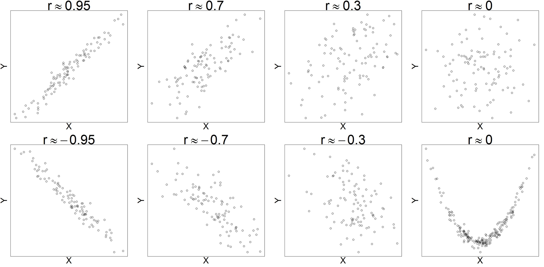
The correlation coefficient has no unit and falls in the interval -1 ≤ r ≤ 1. A positive correlation coefficient (i.e., r > 0) indicates that X and Y increase together, whereas a negative value represents the situation when X increases, Y tends to decrease. The larger the absolute value of the correlation coefficient, the stronger the linear relationship between X and Y. r = 1 (or r = – 1) is a perfect positive (or negative) correlation, which means the observations lie exactly on a straight line without any scatter. Figure 4.16 shows simulated datasets in which the variables X and Y exhibit linear relationships with varying strengths. The scatter plots in the figure display the predictor variable X and response variable Y on the horizontal and vertical axes, respectively.
Most computational software can calculate correlation coefficients with just a single click of a button. However, it is strongly recommended that the correlation coefficient be used together with a scatter plot. This is to avoid incorrect interpretations of a zero correlation coefficient. When r = 0, there is no linear relationship between the two variables. However, this does not rule out other kinds of relationships, e.g., a quadratic relationship. The last scatter plot in Figure 4.16 illustrates this situation.
After establishing the correlation between two variables X and Y, it is often necessary to investigate how one variable affects another. Linear regression models use mathematical equations to quantify how changes in the explanatory (input) variable X affect the response (output) variable Y, in the following structure:
response = trend + scatter
The trend discovered from the data is the linear relationship between the two variables. Mathematically, a simple linear regression model can be expressed as:

where β0 and β1 are fixed coefficients, and the  is a modelling error term representing the random scatters of data observations around the trend line. The slope parameter β1 indicates how much Y increases with each unit increase in X. The following example illustrates the simple linear regression.
Galton’s discovery: Regression to mediocrity and the origins of regression analysis
Sir Francis Galton was the first to formally study the relationship between the heights of parents and children to gain insights into what degree height is an inherited characteristic. He noted that the heights of the children tended to be more moderate than the heights of their parents in the work by Galton (1886).
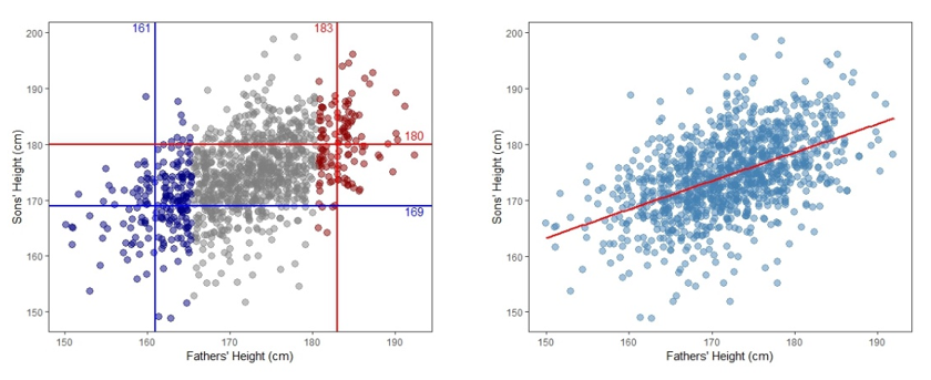
For example, if the parents were very tall, the children tended to be tall but shorter than their parents. If parents were very short, the children tended to be short but taller than their parents were. Galton referred to this phenomenon as “regression to mediocrity”, which led to the development of regression analysis. Figure 4.17 shows the data of the heights of fathers and sons studied by Pearson and Lee (1903). The left panel suggests that the sons’ heights tend to increase as the fathers’ heights increase. For example, the blue-coloured points have average heights of 161 cm and 169 cm for fathers and sons, respectively. In contrast, the red-coloured points show the mean heights for fathers and sons are 183 cm and 180 cm, respectively. Using a straight line to connect the intersections of the mean heights for fathers and sons across the entire dataset captures the general trend of the data, as shown in the right panel of Figure 4.17.
Regression analysis is useful for explaining the general pattern of real-world datasets (hypothesis testing) and making predictions (forecasting) for new observations from the same population. Recall the the real estate example introduced at the start of this chapter (Exploring Sydney’s property market: Insights from web-scraped data). It is possible to apply regression techniques to build a linear model for housing prices based on the dataset introduced in the example. The following demonstration illustrates this approach.
The influence of property size and bedrooms on real estate pricing
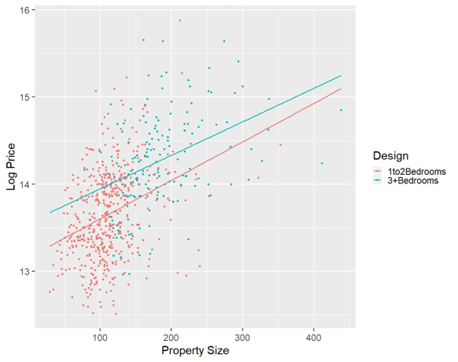
It is well-known that property size is an important variable for determining property prices, especially for apartments. In practice, builders of apartment properties often use the number of bedrooms to attract specific customer groups: compact apartments with one or two bedrooms are designed for young adults and retired people, whereas large properties with more than three bedrooms are designed for families with children.
Figure 4.18 presents apartment properties with less than 500 m2 property size selected from the Kaggle (Kaggle 2021) dataset. The sale prices of the selected properties are shown in a natural logarithm scale on the vertical axis. The property sizes of the apartments are indicated on the horizontal axis. Two separate regression lines are fitted to the apartments depending on the design (i.e., compact vs. large apartments). Similar slopes for the two fitted straight lines suggest that a 1 square metre increase in property size is likely to cause comparable price increases for compact and large apartment properties. The cyan line above the red line indicates that apartments with three or more bedrooms are more expensive than those with one or two bedrooms of the same size. This difference is likely due to the higher construction costs associated with building more bedrooms.
4.4 Statistical tools in practice
Advancements in computational software have greatly streamlined statistical analysis and data visualization processes. Modern tools like Microsoft Excel (Microsoft Corporation, 2018), Python (van Rossum & Drake, 2009), and R (R Core Team, 2021) offer built-in functions for various statistical analyses. In this chapter, most visualization and computation examples are created using R, with the source code available at https://github.com/YangANU/Chapter-4-R-Code
4.5 Test your knowledge
References
- DCJ Statistics (2024). Local Government Housing Kit – Census 2021. [Tableau Dashboard]. Retrieved from https://public.tableau.com/app/profile/dcj.statistics/viz/ LocalGovernmentHousingKit-Census2021/Summary#1.
- Galton, F. (1886), Regression towards mediocrity in hereditary stature. The Journal of the Anthropological Institute of Great Britain and Ireland, 15, 246–263.
- Kaggle. (2021). Sydney house prices: Greater Sydney Property Sample from 2016– 2021. Retrieved from https://www.kaggle.com/datasets/alexlau203/sydney-house-prices? resource=download.
- Pearson, K., & Lee, A. (1903). On the laws of inheritance in man: Inheritance of physical characters. Biometrika, 2(4), 357–462. http://dx.doi.org/10.1093/biomet/2.4.357
Additional readings
- Introduction to statistics and data visualisation
- Simple Learning Pro. (n.d.). Introduction to statistics and data visualisation [Video]. YouTube. https://www.youtube.com/watch?v=MXaJ7sa7q-8
- Simple Learning Pro. (n.d.). Statistics and data visualisation explained [Video]. YouTube. https://www.youtube.com/watch?v=uHRqkGXX55I
- Simple Learning Pro. (n.d.). Data visualisation basics [Video]. YouTube. https://www.youtube.com/watch?v=mk8tOD0t8M0
- Distribution and central tendency
- Simple Learning Pro. (n.d.). Understanding distribution and central tendency [Video]. YouTube. https://www.youtube.com/watch?v=sK0RY-Qkug4
- Simple Learning Pro. (n.d.). Exploring central tendency in statistics [Video]. YouTube. https://www.youtube.com/watch?v=vcbMinm_1Q8
- Central limit theorem
- 3Blue1Brown. (n.d.). The Central Limit Theorem explained visually [Video]. YouTube. https://www.youtube.com/watch?v=zeJD6dqJ5lo&ab_channel=3Blue1Brown
- Laser measurement tools are electronic devices that use laser beams to accurately measure distances, areas, and volumes. These tools are commonly used in real estate, construction, engineering, and interior design for precise measurements. ↵
About the author

name: Yang Yang
institution: University of Newcastle
Yang Yang is a lecturer at the University of Newcastle, Australia, with expertise in demography forecasting, climate data analysis, and functional time series modelling. He holds a PhD in Statistics from ANU and has published extensively in top-tier journals.
