2 Exploratory Data Analysis
Learning Outcomes
At the end of this chapter you should be able to:
- state the aims of EDA;
- classify data by types and explain why this is important;
- prepare appropriate graphical displays of data and interpret the output;
- prepare appropriate numerical summaries of data and interpret them;
- describe data;
- understand summation notation and summation rules;
- understand the difference between mean and median;
- understand the effect of transforming data.
Contents
2.7 Sample variance and standard deviation
2.8 Linear transformation of data
2.1 Introduction
Table 2.1 shows the salaries of 110 accounting related jobs from the Seek website. What does this data tell us? This is just a table of numbers! It is difficult to pick out any information easily from the table. For example, what are the maximum and minimum salaries?
We need some basic information from the data. What is the data telling us? We need to encapsulate the information in the data and present it in such a way that it makes some sense. We also need to know how to describe the data.
| 100 | 105 | 90 | 94 | 67 | 100 | 75 | 100 | 100 | 100 | 62 |
| 80 | 65 | 110 | 90 | 76 | 80 | 80 | 101 | 120 | 90 | 125 |
| 80 | 100 | 75 | 80 | 146 | 90 | 60 | 90 | 70 | 75 | 68 |
| 70 | 80 | 65 | 103 | 80 | 85 | 90 | 65 | 95 | 120 | 90 |
| 79 | 80 | 99 | 201 | 99 | 105 | 85 | 100 | 90 | 80 | 110 |
| 85 | 75 | 110 | 100 | 75 | 80 | 115 | 85 | 110 | 85 | 80 |
| 106 | 70 | 100 | 75 | 90 | 70 | 100 | 85 | 110 | 120 | 97 |
| 110 | 95 | 100 | 100 | 100 | 60 | 130 | 75 | 85 | 110 | 90 |
| 70 | 110 | 80 | 80 | 94 | 85 | 70 | 62 | 75 | 60 | 80 |
| 85 | 100 | 110 | 75 | 88 | 110 | 120 | 70 | 80 | 120 | 93 |
Table 2.1 Salaries (in $,000) for accounting related jobs (from Seek website, accessed 26 March 2023).
The aims of Exploratory Data Analysis (EDA)
EDA aims to highlight the key and salient features of the data, such as
- Shape,
- Spread,
- Central location,
- Outliers, and
- any patterns.
EDA summarises the key aspects of the data. In some situation that is all that is needed, while in other situations that all that can be done.
EDA has two complementary aspects.
- Graphical techniques. Here we represent the data by appropriate graphs and charts.
- Numerical summaries. We extract numerical statistics from the data that represent and summarise the data.
2.2 Types of Data
The type of data determines how it is presented and the appropriate summary statistics that should be computed. Data can be broadly classified as in Figure 2.1 and Table 2.2.
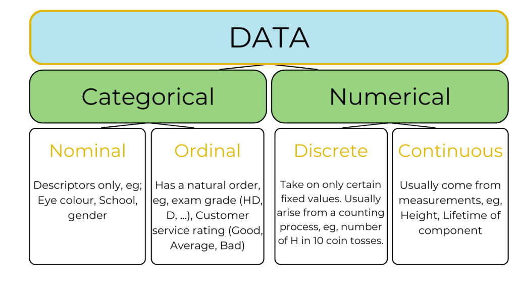
| Data Type | Data sub-type | Definition | Examples |
|---|---|---|---|
| Qualitative
(Categorical) |
Nominal | Categorised by names only | Colour, gender, species |
| Qualitative
(Categorical) |
Ordinal | Arranged in classes that form a naturally ordered sequence from higher to lower | Exam grade |
| Quantitative | Discrete | Take only certain fixed values that are known in advance and can be listed. Usually arise from counting processes. | Number of H in ten tosses of a coin |
| Quantitative | Continuous | Take on any value in an interval. Usually arise from measurements. | Length, volume |
2.3 Graphical representation of data
Several types of charts and graphs are used in EDA. Here we consider only a few key ones. Usually some adjustment to plots are needed to reveal the key features of the data. In particular, one may produce several graphs and charts and select those that best highlight the important aspects of the data.
2.3.1 Histograms
A histogram is a frequency or relative frequency distribution. It is mainly used for continuous data and is the most common graph used in statistics. It allows us to see:
- shape — symmetrical, skewed;
- spread;
- outliers;
- peaks;
- any groups in the data; and
- any other special features or data points.
Histograms are constructed so that the area of the bar is equal to the frequency of the corresponding class interval. This gives a visual impression of the number of data points in an interval. Usually intervals of equal width are selected, so the height is proportional to the frequency of the interval.
Example 2.1
The accounting salaries data of Table 2.1 is available in the file AcctSalaries.txt from the Appendix. A histogram of the data can be obtained using the R code below.
acct <- read.table("AcctSalaries.txt", sep = "\t" header = T)
#Comments in R are preceded on a line with the hash.
hist(acct$Salaries, nclass = 20,xlab = "Salaries ($,000)", main = "Accounting Salaries")
#nclass specifies the number of classes to use. This option can be omitted.
#If nclass is specified then R will try to comply, but not always.
box()
Explanation of code.
The first line reads the data into R. The first argument is the file name, which is this case is a .txt file. The next argument is the separator, which in this case is a tab (“\t”). In some other cases it may be a space (” “), or can be left unspecified. The next argument specifies that the data contains a header row which gives the column (or variable) names.
The second line produces the histogram. We have specified the number of classes to use, but this can be omitted. If specified, R will do its best to comply. The option “xlab = ” gives the label for the  -axis, and “main =” defines the main title of the plot. Finally, “box()” draws a box around the plot to make it visually attractive.

Skewness
The shape of the distribution is described by skewness.
Left skewed data is characterized by a left tail, that is, a few small data values. Similarly right skewed data is characterized by a right tail, that is, a few large data values. Finally, symmetric distribution does not have either a left or right tail, but is symmetric about its centre point. Typical histograms for these are shown in Figure 2.3.

Outliers
An outlier is a point that is away from the bulk of data points. For example, in Figure 2.2, the histogram for the accounting data shows a point above 200. This point is larger than all the other data points. This point is an outlier. Usually outliers are very large or very small values.
Describing data
Along with exploring data, we also need to describe the key features.
Example 2.2: Accounting salaries
Most of the salaries are between $50,000 and $150,000. There is one outlier above $210,000. The salaries are right skewed, typical of financial data.
Note that the reason financial data are typically right skewed is that such data usually contain a few large values.
Tip!
Usually several histograms are produced with different number of class intervals. The class boundaries can also be specified explicitly. The one that best represents the key features of the data is selected for presentation.
2.3.2 Box and Whisker Plots
Figure 2.4 shows a boxplot of the accounting salaries data. It is produced using the following self-explanatory code in R.
boxplot(acct$Salaries, ylab = "Salaries ($,000)", main = "Boxplot of Accounting salaries")
The box contains 50% of the data. The lower end of the box is lower quartile, the upper end is the upper quartile, and the centre line represents the median. Outliers as deemed by the plot are shown as empty circle. The right skewness in the data is clear, but the groups in data that are evident in a histogram are not visible here.

2.3.3 Pie Charts
Pie charts are used for discrete or qualitative data. The area of each slice is proportional to the frequency or percentage in the corresponding category. Equivalently, the angle of each sector is proportional to the frequency or percentage in the corresponding category.
Example 2.3
Table 2.3 shows tourist arrivals in Australia in 2022 and the countries of origin. The data is available in the file Tourism.xlsx from the Appendix. A pie chart of the data is presented in Figure 2.5. (Source: Tourism Research Australia, licensed under a Creative Commons BY 4.0 (CC BY 4.0) licence.)
| Country | Arrivals | Percentage |
|---|---|---|
| New Zealand | 632.06 | 18.51 |
| United Kingdom | 369.54 | 10.82 |
| USA | 300.30 | 8.79 |
| India | 290.84 | 8.52 |
| Singapore | 255.24 | 7.47 |
| China | 87.37 | 2.56 |
| Indonesia | 83.37 | 2.44 |
| Canada | 81.0 | 2.37 |
| Germany | 80.32 | 2.35 |
| Malaysia | 79.81 | 2.34 |
| Others | 1155.17 | 33.82 |

The R code for the pie chart is given below.
library(readxl)
tourism <- read_xlsx("Tourism.xlsx")
lbls <- paste(tourism$Country, round(tourism$Percentage))
lbls <- paste(lbls, "%", sep = "")
pie(tourism$Arrivals, labels=lbls, main = "Tourism arrival by country")
The first line loads the library readxl, which is required to read Excel files. The second line reads the data. The third pastes together the variable names (as text) together to prepare labels for each slice of the pie corresponding to the country and percentage of tourists. The next line adds in the % symbol to these labels. The final line plots the pie chart, adds in the labels and gives a main title for the plot.
2.3.4 Bar Charts
These are similar to pie charts and are used for discrete or qualitative data. The height of each bar is proportional to the frequency or percentage in the corresponding category. Figure 2.6 shows a bar chart of the tourism data. The R code is as follows.
barplot(height = tourism$Arrivals/1000, names = tourism$Country, col = c(1:nrow(tourism)), xlab = "", ylab = "Arrivals", las = 2,
ylim = c(0, max(tourism$Arrivals/1000)+15))
box()
The barplot() function produces the basic plot. The option col determines the colour of the bars. In our case we have a different colour for each bar. The function nrow() gives the number of rows in the dataframe. The option las = 2 prints the -axis labels perpendicular to the axis. Finally, the ylim() gives the limits of the  -axis. Note that we have scaled the Arrivals by 1000 (as in Table 2.3) to make the plot more readable.

Note that pie charts and bar charts have the same information. However, bar charts are not based on percentages, but actual frequencies, so are more general. Of course a bar chart of percentages can also be produced. However, a pie chart requires the total percentage to sum to 1. Thus bar charts can be used when the levels of the category that are available are not exhaustive, that is, the percentages do not add to 100.
Another important factor is that it is easier for the eye to discern differences in heights than differences in angles. For this reason, bar charts are preferred over pie charts.
2.3.5 Pareto Charts
Pareto charts are also used for categorical (qualitative) data. This is simply a bar chart plotted in order of frequency or relative frequency. Pareto charts are used to identify the major cause of faults or problems. It allows one to set priorities for action to reduce faults/problems and is used in all levels of management and production.
Example 2.4
Figure 2.6 shows a Pareto chart for Emergency Department presentations at hospitals in Australia. It shows that the major presentations are Urgent, followed by Semi-Urgent. The lowest number of cases are Resuscitation. This indicates to the hospital that most staff are needed who can handle urgent cases.
In R the Pareto chart is simply a barchart with the values first sorted in decreasing order. Another way is to use the quality control library (qcc), as below.
library(qcc)
x <- c(67589, 1333462, 3383378, 3184019, 818373)/10000
Count <- as.matrix(x)
rownames(Count) <- c("Resuscitation", "Emergency","Urgent", "Semi-urgent","Non-urgent")
Count
                  [,1]
Resuscitation   6.7589
Emergency     133.3462
Urgent        338.3378
Semi-urgent   318.4019
Non-urgent     81.8373
NCount <- Count[order(-Count[ , 1]), ]
NCount
       Urgent   Semi-urgent     Emergency    Non-urgent Resuscitation
     338.3378      318.4019      133.3462       81.8373        6.7589
barplot(NCount, ylab = "Frequency (10,000)",
        xlab = "", cex.names = 0.75,
        cex.lab = 0.75, cex.axis = 0.75,
        main="Emergency Department Presentations",
        cex.main = 0.75,ylim = c(0,max(NCount+100)),
        col = 1:length(x), las = 2,
        beside = TRUE
 )
box()

(Data from Australian Government, Institute of Health and Welfare, Emergency Department Care licensed under a Creative Commons BY 4.0 (CC BY 4.0) licence.)
2.4 Numerical summaries of data
Along with the charts and graphs, numerical summaries of data are also important in exploratory analysis. The following are typical numerical summaries. Some of these have already been used in the context of boxplots.
- Mean — usual average of the data.
- Median — value below which half (50%) of the data lie. For data with an odd number of values, sort the data and find the middle entry. For data with an even number of values, sort the data and average the two middle entries.
- Minimum— smallest data value
- Maximum— largest data value
- Lower quartile (LQ)— median of the lower half of data. Value below which 25% of data lie.
- Upper quartile (UQ)— median of the upper half of data. Value above which 25% of data lie.
- Variance— a measure of the spread of the data. Is in square units.
- Standard deviation— square root of variance. A measure of spread of the data, usually preferred over variance. Has the same units as the data.
Usually we present a five-point summary of data, including the mean, median, lower quartile, upper quartile and standard deviation. It is also important to include the minimum and maximum, and the number of observations, making an eight-point summary.
Example 2.5 Accounting Salaries Data
For the Accounting salaries data of Example 2.2, the following is an eight-point summary.
N = 110
Minimum = $60,000
LQ = $79,250
Median = $90,000
Mean = $91,000
UQ = $100,000
Maximum = $201,000
Standard deviation = $20,097
Example 2.6 Describing Data: Accounting Salaries
The minimum salary is $60 000 and the maximum is $201 000, with a standard deviation of $20 097. The lower and upper quartiles are $79 250 and $100 000 respectively and the median salary is $90 000. The mean salary is $91 000. The histogram shows that most of the salaries lie between below $110 000, and the salary of $201 000 is an outlier. The data is right skewed.
Some properties of Mean and Median
Consider the three data sets below.
- Set 1: 1, 2, 3, 4, 5, 6, 7, 8, 9, 10. Mean = Median = 5.5. Data is symmetric.
- Set 2: 1, 2, 3, 4, 5, 6, 7, 8, 9, 1000. Mean = 104.5, Median = 5.5
- Set 3: 1, 2, 3, 4, 5, 6, 70, 80, 90, 100. Mean = 36.1, Median = 5.5
Clearly if only one of mean or median is stated then this may give a false impression of the data, or certainly not a complete description. For Set 1, since the data is symmetric either the mean or median will suffice. For Set 2, the mean does not capture the fact that most of the data values are quite small, and the median conceals the one large data point. Finally, for Set 3, the median masks the larger data values.
The mean is sensitive to tail or extreme values of data. The median is insensitive to tail or extreme values. Which is quoted often depends on the context and what the objective of the statistics is. For example, for house prices often the median is quoted, as this accurately reflects that half the prices are below this. The mean price will be influenced and inflated by a few expensive houses and will misrepresent the data.
Always be careful of false impressions created by quoting only the mean or median. Best practice is to provide a seven- or eight-point summary for a more complete description of the data.
2.5 Summation Notation
In statistics many procedures depend on summing data. For example, the mean of a data set is the sum of the data divided by the number of data points. Similarly, the variance also depend on a sum of squares. So it is useful to introduce a short notation for the sum of a set of numbers.
Consider the data  . We use the shorthand notation to write sums as follows:
![\[x_1 + x_2 + \ldots, + x_n = \sum_{i=1} ^n x_i.\]](https://oercollective.caul.edu.au/app/uploads/quicklatex/quicklatex.com-ab70f22569439eaab4e68aee5421f6e7_l3.png "Rendered by QuickLaTeX.com")
This is read as “sum from  to
to  of
of  “. The summation index is
  , and controls what is being summed. The symbol
  is the Greek letter upper case sigma, and in known as summation notation or sigma notation.
The summation index is a place holder or “dummy variable”, so
![\[x_1 + x_2 + \ldots, + x_n = \sum_{j=1} ^n x_j.\]](https://oercollective.caul.edu.au/app/uploads/quicklatex/quicklatex.com-d55b40b99879e1b13146436c14eee12b_l3.png "Rendered by QuickLaTeX.com")
Example 2.7
For the data set  ,
,
(a)
![\[\sum_{i=1}^6 x_i = x_1 + x_2 + x_3 + x_4 + x_5 + x_6 = 5.\]](https://oercollective.caul.edu.au/app/uploads/quicklatex/quicklatex.com-3f32706e8de4882fc051d66eb0152c54_l3.png "Rendered by QuickLaTeX.com")
(b)
![\[\sum_{i=1}^4 x_i = x_1 + x_2 + x_3 + x_4 = 7.\]](https://oercollective.caul.edu.au/app/uploads/quicklatex/quicklatex.com-b38a5fbf9dad866fb656e5b6f2dee8d4_l3.png "Rendered by QuickLaTeX.com")
(c)
![\[\sum_{i=1}^6 x_i^2 = x_1^2 + x_2^2 + x_3^2 + x_4^2 + x_5^2 + x_6^2 = 31.\]](https://oercollective.caul.edu.au/app/uploads/quicklatex/quicklatex.com-e1c60c71e3b049c06e25cc9333998b47_l3.png "Rendered by QuickLaTeX.com")
(d)
![\[\sum_{i=1}^6 (x_i +4) &= (x_1 + 4) + (x_2 + 4) + (x_3 +4) + (x_4 +4) + (x_5 +4) + (x_6 +4)&= 29.\]](https://oercollective.caul.edu.au/app/uploads/quicklatex/quicklatex.com-8cb15ebaa6303eae9a9797b290bf7936_l3.png "Rendered by QuickLaTeX.com")
This notation indicates that we add 4 to each number and then perform the sum.
(e)
![\[\sum_{i=1}^6 x_i +4 = 5 + 4 = 9.\]](https://oercollective.caul.edu.au/app/uploads/quicklatex/quicklatex.com-f2c4e641b7ad6a4c1853ebaf32e120b6_l3.png "Rendered by QuickLaTeX.com")
This notation indicates that the sum is to be performed first and then 4 is to be added.
Summation Rules
S1
![\[\sum_{i=1} ^ n c = \underbrace {c+c+ \ldots + c}_{\text{$n$ terms}} = nc.\]](https://oercollective.caul.edu.au/app/uploads/quicklatex/quicklatex.com-92b6c5b8e0d925211e92d73d43613209_l3.png "Rendered by QuickLaTeX.com")
S2
![\[\sum_{i=1} ^ n cx_i = cx_1 + cx_2 + \ldots + cx_n = c(x_1 + x_2 + \ldots + x_n) = c \sum_{i=1} ^ n x_i.\]](https://oercollective.caul.edu.au/app/uploads/quicklatex/quicklatex.com-2c70bbf7b0f2df21518298744e9795d3_l3.png "Rendered by QuickLaTeX.com")
S3

S4 Similar to the last result,
![\[\sum_{i=1} ^ n(x_i - y_i) = \sum_{i=1} ^ n x_i - \sum_{i=1} ^ n y_i.\]](https://oercollective.caul.edu.au/app/uploads/quicklatex/quicklatex.com-865cf581d4857a4bca0339246b0f0514_l3.png "Rendered by QuickLaTeX.com")
Example 2.8
Suppose  Compute the following.
(a) 
(b) 
(c) 
Solution
(a)
![\[\sum_{i=1}^{10} (x_i + y_i) = \sum_{i=1}^{10} x_i + \sum_{i=1}^{10} y_i = 45 + 30 = 75.\]](https://oercollective.caul.edu.au/app/uploads/quicklatex/quicklatex.com-25fc152d4e02224b452f96a74b10eed2_l3.png "Rendered by QuickLaTeX.com")
(b)
![\[\sum_{i=1}^{10} (3x_i - 4y_i) = 3\sum_{i=1}^{10} x_i -4\sum_{i=1}^{10} y_i = 3\times 45 - 4\times 30 = 15,\]](https://oercollective.caul.edu.au/app/uploads/quicklatex/quicklatex.com-a8d626a36699595b62363636848d7e37_l3.png "Rendered by QuickLaTeX.com")
using summation rules S3 and S2.
(c)

Notes
-
![\[\sum_{i=1}^n x_iy_i = x_1y_1 + x_2y_2 + \ldots + x_ny_n \ne \left(\sum_{i=1}^n x_i\right)\left(\sum_{i=1}^n y_i\right).\]](https://oercollective.caul.edu.au/app/uploads/quicklatex/quicklatex.com-7a984d264727d357d4b836a96fde4b91_l3.png "Rendered by QuickLaTeX.com")
In particular, if we take
 then the left hand side is , while the right hand side is
  .
. -
![\[\sum_{i=3}^n c = (n-2)c.\]](https://oercollective.caul.edu.au/app/uploads/quicklatex/quicklatex.com-3bbcf4730e2b0e170c7dd51a3ed4c905_l3.png "Rendered by QuickLaTeX.com")
Note that the second sum starts from 3, so the first two terms are omitted, that is, only ( ) terms are to be summed.
2.6 Sample Mean
Let be data from a sample. The sample mean is given by
![\[\overline x = \frac{1}{n}\sum_{i-1} ^ n x_i = \frac{x_1 + x_2 + \ldots + x_n}{n}.\]](https://oercollective.caul.edu.au/app/uploads/quicklatex/quicklatex.com-1ce06abee75493823abade88b7db4959_l3.png "Rendered by QuickLaTeX.com")
Note that this definition implies that
(1) 
Some useful results
-
![\[\sum_{i=1} ^ n (x_i - \overline x) = 0.\]](https://oercollective.caul.edu.au/app/uploads/quicklatex/quicklatex.com-55c89f3b421b68d26fc1aa2586c2cf4e_l3.png "Rendered by QuickLaTeX.com")
-
![\[\sum_{i=1} ^ n (x_i - \overline x)^2 = \sum_{i=1} ^ n x_i^2 - n{\overline x}^2.\]](https://oercollective.caul.edu.au/app/uploads/quicklatex/quicklatex.com-7a2d82993078b37578bd1c2e1ed804b8_l3.png "Rendered by QuickLaTeX.com")
-
![\[\sum_{i=1} ^ n (x_i - c)^2\]](https://oercollective.caul.edu.au/app/uploads/quicklatex/quicklatex.com-4772688c572bbd1243db71902607ceb6_l3.png "Rendered by QuickLaTeX.com") is a minimum when
is a minimum when  .
.
Proof
- The proof simply uses the rules of summation.

from the result in equation (1). Note that  is a constant with respect to the summation index , so the second sum is simply
  .
.
2. We need to multiply out the square term. We do this by multiplying the first term in the first bracket with the second bracket, and then the same for the second term.
![\begin{align*} \sum_{i=1}^n \left(x_i - \overline x\right)^2 &= \sum_{i=1}^n \left(x_i - \overline x\right)\left(x_i - \overline x\right)\\ &= \sum_{i=1}^n[x_i\left(x_i - \overline x\right) - \overline x\left(x_i - \overline x\right)]\\ &= \sum_{i=1}^n\left(x_i^2 - \overline x x_i\right) - \overline x \underbrace{\sum_{i=1}^n \left(x_i - \overline x\right)}_{=0}\\ &= \sum_{I=1} ^ n x_i^2 - \overline x \underbrace{\sum_{i=1}^n x_i}_{=n\overline x}\\ &= \sum_{I=1} ^ n x_i^2 - n\overline{x}^2 \end{align*}](https://oercollective.caul.edu.au/app/uploads/quicklatex/quicklatex.com-2ec300956932aa8e703b453941caaeb4_l3.png "Rendered by QuickLaTeX.com")
3.
(2) 
This is a quadratic in  . Now the quadratic
  ,
,  , has minimum value when
![\[x = -\frac{B}{2A}.\]](https://oercollective.caul.edu.au/app/uploads/quicklatex/quicklatex.com-d42e9631b99c5a31b5314c8d39630160_l3.png "Rendered by QuickLaTeX.com")
Thus, the expression in equation (2) has minimum value when
![\[c = -\frac{-2n\overlin{x}}{2n} = \overline{x}.\]](https://oercollective.caul.edu.au/app/uploads/quicklatex/quicklatex.com-55a1ce42bfcda04cb5fd12452ac2f379_l3.png "Rendered by QuickLaTeX.com")
2.7 Sample variance and sample standard deviation
Let be data from a sample. The sample variance is given by
(3) 
Note that we always divide by  in the formula for variance, as this gives an unbiased estimate of the population variance (see Chapter 11).
The positive square root of variance is called the standard deviation:
(4) 
It is simpler to compute variance using the formula
(5) 
Example 2.9
Calculate the mean and variance of a data set which has summary statistics
![\[\sum_{i=1}^{10} = 10, \quad \sum_{i=1}^{10} x_i^2 = 100.\]](https://oercollective.caul.edu.au/app/uploads/quicklatex/quicklatex.com-26a2525eca8e3149dc82a006fc6d8705_l3.png "Rendered by QuickLaTeX.com")
Solution

2.8 Linear transformation of data
Sometimes we need to obtain summary statistics for data that have been transformed linearly.
Example 2.10
The average annual cost for online services for an organisation over the last fifteen years is USD 25,000, with a standard deviation of USD 5,000. What are the mean cost and standard deviation in AUD? Use the exchange rate 1 AUD  0.66716 USD.
Solution
Let and  denote the annual costs in USD and AUD respectively. Then
  and
and  . Now
. Now
![\[x_i = 0.66716 y_i,\]](https://oercollective.caul.edu.au/app/uploads/quicklatex/quicklatex.com-6de5d6137920dc580f1837bacb3ef9a3_l3.png "Rendered by QuickLaTeX.com")
(each AUD is worth 0.66716 USD), so
![\[y_i = \frac{x_i}{0.66716}.\]](https://oercollective.caul.edu.au/app/uploads/quicklatex/quicklatex.com-0e770886470c87cfe91f2b07336b0402_l3.png "Rendered by QuickLaTeX.com")
The mean and standard deviation are, respectively,
![\[\overline y = \frac{\overline x}{0.66716} = \frac{25,000}{0.66716} = 37,472.27\]](https://oercollective.caul.edu.au/app/uploads/quicklatex/quicklatex.com-0e123427d07395ed71f24cb13a4aabae_l3.png "Rendered by QuickLaTeX.com")
and
![\[s_y = \frac{s_x}{0.66716} = \frac{5,000}{0.66716} = 7,494.454.\]](https://oercollective.caul.edu.au/app/uploads/quicklatex/quicklatex.com-9b1a8554e94f9ff0a32c48024c66b163_l3.png "Rendered by QuickLaTeX.com")
Exercise
The annual before tax profit for an international company is on average AUD 4.5 million with a standard deviation of AUD 0.5 million. The profit is transferred to Germany, where the company has to pay a flat company tax of 30%. The exchange rate from AUS to Euro is 1 Euro AUD 0.61375449. What are the mean and standard deviation of the amount of tax the company will pay?
General Result
Consider the data with mean and standard deviation  . We transform the data to obtain a new data set
  , where
![\[y_i = ax_i + b.\]](https://oercollective.caul.edu.au/app/uploads/quicklatex/quicklatex.com-df597bf3f9c5dd78a461bbf11691ae7c_l3.png "Rendered by QuickLaTeX.com")
Then
Mean: 
Variance: Standard deviation: |


Note that  is the absolute value of
  , which simply means take the positive equivalent of . For example,
  and
and  .
.
Standardised scores
Consider the data with mean and standard deviation . Put
![\[z_i = \frac{x_i - \overline x}{s_x} = \frac{1}{s_x}\ x_i - \frac{\overline x}{s_x}.\]](https://oercollective.caul.edu.au/app/uploads/quicklatex/quicklatex.com-f81cb7b88e8ad6d889936c1996f835e7_l3.png "Rendered by QuickLaTeX.com")
Then using the result for transformed data, the mean and standard deviation of the transformed data is
![\[\overline{z} = \frac{1}{s_x}\ \overline x - \frac{\overline x}{s_x} = 0, s_z = \frac{1}{s_x}\ s_x = 1.\]](https://oercollective.caul.edu.au/app/uploads/quicklatex/quicklatex.com-7965f0f98506a9f8bd3f1cf32d511d56_l3.png "Rendered by QuickLaTeX.com")
That is, the  have mean 0 and standard deviation (and variance) 1. We call
  the standardised scores.
2.9 Non-linear transformation of data
Data that is skewed can be made more symmetrical by non-linear transformation.
Right or positively skewed data
Such data can be made more symmetric by taking the log, square root or higher root of the data. The idea is the following. Consider that numbers 1, 4, 9, 16, 25, 36, which are quite far apart, and the spread increases as the numbers increase. But their square roots are 1, 2, 3, 4, 5, 6, which are evenly spread out. Taking the log, square root or other higher root of the data pulls the right tail in, making the resulting data more symmetrical.
Left or negatively skewed data
These data can be made more symmetrical by taking the exponential (that is,  ), square or other higher power of the data. These transformations pulls out the right tail, improving the symmetry of the resulting data.
Some trial and error is required here. We will see this again in our chapter on Regression analysis.
Example 2.12 Right skewed data

The first plot shows raw data that is right or positively skewed. The second plot shows the log of the data, which indicates the resulting data is now left skewed. Thus the log transformation is too severe. The third plot shows the square root of the data, which shows that the result is still right skewed. The final plot is of the cube root transformed data, which has achieved symmetry.
Example 2.13 Left skewed data
The first plot shows that the data is left or negatively skewed. The second plot is of the square of the data, which still shows some left skewness. The third plot is of the cube of the data, which is fairly symmetric. The final plot is of the exponential of the data, which is also quite symmetric. However, the cube is the best transformation here.

2.10 Tables
Tables are usually prepared to summarise large data sets by categories. Well prepared tables can provide very pertinent and important insight into the structure of the data. Some thought is required in preparing good tables. In particular, think about what type of information will be useful.
Example 2.14 The Bank data set
The female employees of The Bank have sued the bank for gender discrimination. The claim is that the female employees are paid much less than their male colleagues. The following variables are available for each of the 208 employees of The Bank.
(Source: Albright, S. C. and Winston, W. L. (2020) Business Analytics: Data Analysis and Decision Making. 7th Edition. Cengage.)
- EducLev: a categorical variable indicating education level, with values 1 (finished high school), 2 (some tertiary education), 3 (bachelor’s degree), 4 (some postgraduate courses), 5 (postgraduate degree)
- JobGrade: current job level, the possible levels being 1 (lowest) to 6 (highest)
- YrHired: year employee was hired
- Yrborn: year employee was born
- Gender: Female and Male
- YrsPrior: years of work experience at another bank prior to working at The Bank
- PCJob: yes/no indicating if the employee uses a PC
- Salary: thousands of dollars
Exercise
- What data summaries do we need?
- What tables should we produce?
- What graphs should we produce?
Example 2.15 The Bank data set
The table below gives the mean salary by Gender and Education level for The Bank data set. The number of employees for each combination of the variables is given in brackets. Describe the key features of this data.
| Education Level | |||||
|---|---|---|---|---|---|
| 1 | 2 | 3 | 4 | 5 | |
| Female | 35.2 (33) | 35.1 (29) | 36.7 (43) | 39.5 (5) | 41.8 (30) |
| Male | 40.0 (3) | 32.0 (6) | 39.2 (20) | 44.7 (3) | 51.8 (36) |
Data source ©Cengage Learning Inc. Reproduced with permission. www.cengage.com/permissions
Solution
When considering two-way tables, one should look for patterns along the rows and columns. For female employees education as level increases, so does mean salary. For males the mean salary decreases from education level 1 to 2, but then increases with education level. Except for education level 2, males have a higher mean salary than females at the same education level. Another important observation is that females dominate the lower education levels 1 to 3, but are comparable at levels 4 and 5.
Example 2.16 The Bank data set
Given below is a table of mean salary by Gender and Job Grade for The Bank data set. The number of employees for each combination of the variables is given in brackets. Describe the key features of this data.
| Job Grade |
||||||
|---|---|---|---|---|---|---|
| 1 | 2 | 3 | 4 | 5 | 6 | |
| Female | 32.6 (48) | 34.9 (29) | 38.5 (36) | 44.4 (17) | 51.1 (9) | 30.0 (1) |
| Male | 31.1 (12) | 34.2 (13) | 39.3 (7) | 43.8 (11) | 49.8 (12) | 70.9 (13) |
Data source ©Cengage Learning Inc. Reproduced with permission. www.cengage.com/permissions
Solution
We see that in general the mean salary increases with job grade for both males and females. The mean salaries at all job grades are comparable for males and females. The exception is the lone female employee at job grade 6, who receives less that half that of males at the same job grade. Another interesting observation is that more females are at job grades 4 and below, while more males are at job grades 5 and above. In particular, job grade 6 has 13 males and only 1 female.
Exercise
What other tables would be useful to produce in order to further compare the salaries of male and female employees?
Tables in R
The following code produces a table counts of the bank employees by Gender and Job Grade, and one of mean salaries by Gender and Job Grade. Note that tapply() is a very useful function, which takes the first argument and computes the function specified by the last argument with respect to the variables specified in the second argument. In this case we have specified two variables in the second argument as a list. You are encouraged to search for details of this function online.
> bank <- read_xlsx("Bank.xlsx")
> (T1 <- table(bank$Gender, bank$EducLev))

          1  2  3  4  5
  Female 33 29 43  5 30
  Male    3  6 20  3 36
> sum(T1)
[1] 208
> tapply(bank$Salary,list(bank$Gender,bank$EducLev), mean)
              1        2        3        4        5
Female 35.17606 35.13103 36.71628 39.50000 41.78267
Male   39.93333 31.97000 39.24750 44.66667 51.77222
2.11 Summary
- Exploratory data analysis should be performed before any other analysis of data.
- Two main parts–graphs and summary statistics.
- What type of graphs and summaries depends on type of data–categorical (nominal or ordinal), numerical (continuous or discrete).
- The purpose of EDA is to discover and reveal the key and salient features of the data, such as central tendency, spread, distribution, groups, outliers, and any other features that may be relevant given the context.
- Understand summation notation and how to manipulate simple expressions. Be able to prove simple results involving summation notation.
- Be able to calculate mean and variance using appropriate formulae when given summary statistics.
- Be able to calculate means and variances for linearly transformed data.
- Understand the effects of non-linear transformation of data.
- Know what standardisation is and be able to use it when required.
- Prepare table from given data and interpret them.
