6.6 Quantifying Effects
In the previous sections, we discussed how we can use data to test hypotheses. Those methods provided a binary answer: we either reject or fail to reject the null hypothesis. However, this kind of decision overlooks a couple of important questions. First, we would like to know how much uncertainty we have about the answer (regardless of which way it goes). In addition, sometimes we don’t have a clear null hypothesis, so we would like to see what range of estimates are consistent with the data. Second, we would like to know how large the effect actually is, since as we saw in the weight loss example in the previous section, a statistically significant effect is not necessarily a practically important effect.
In this section, we will discuss methods to address these two questions: confidence intervals to provide a measure of our uncertainty about our estimates, and effect sizes to provide a standardised way to understand how large the effects are. We will also discuss the concept of statistical power which tells us how likely we are to find any true effects that actually exist.
Confidence Intervals
So far in the book we have focused on estimating a single value statistic. For example, let’s say we want to estimate the mean weight of adults in the NHANES dataset, so we take a sample from the dataset and estimate the mean. In this sample, the mean weight was 79.92 kilograms. We refer to this as a point estimate since it provides us with a single number to describe our estimate of the population parameter. However, we know from our earlier discussion of sampling error that there is some uncertainty about this estimate, which is described by the standard error.
You should also remember that the standard error is determined by two components:
- the population standard deviation (which is the numerator), and
- the square root of the sample size (which is in the denominator).
The population standard deviation is generally unknown and a fixed parameter that is not under our control, whereas the sample size is under our control. Thus, we can decrease our uncertainty about the estimate by increasing our sample size – up to the limit of the entire population size (which is very rare and if you get to this point, then there is no uncertainly at all given that you can just calculate the population parameter).
We would often like to have a way to more directly describe our uncertainty about a statistical estimate, which we can accomplish using confidence intervals. Most people are familiar with confidence intervals through the idea of a “margin of error” for political polls. These polls usually try to provide an answer that is accurate within +/- 3 per cent. For example, when a candidate is estimated to win an election by 9 percentage points with a margin of error of 3, the percentage by which they will win is estimated to fall within 6-12 percentage points.
In statistics, we refer to this kind of range of values as a confidence interval – the wider the confidence intervals are, the more uncertain we are about our parameter estimate.
Confidence intervals are notoriously confusing, primarily because they don’t mean what we might intuitively think they mean. If I tell you that I have computed a “95% confidence interval” for my statistic, then it would seem natural to think that we can have 95% confidence that the true parameter value falls within this interval. However, as we will see throughout the book, concepts in statistics often don’t mean what we think they should mean. In the case of confidence intervals, we can’t interpret them in this way because the population parameter has a fixed value – it either is or isn’t in the interval – and there is no way for us to know. Therefore, it doesn’t make sense to talk about the probability of that occurring. Jerzy Neyman, the inventor of the confidence interval, said, “the parameter is an unknown constant and no probability statement concerning its value may be made” (Neyman, 1937).[1]
Instead, we have to view the confidence interval procedure from the same standpoint that we viewed hypothesis testing – as a procedure that in the long run will allow us to make correct statements with a particular probability. Thus, the proper interpretation of the 95% confidence interval is that – it is an interval that will contain the true population mean 95% of the time and for the intervals to not include the true population mean about 5% of the time.
Confidence Interval – a Simulation
This web simulation offers a visual way to further understand Confidence Intervals.[2] As a user, choose your desired Sample Size, Population Mean, Confidence Level, Number of Simulated Samples, Confidence Levels and Population Standard Deviation. This tool emphasises several key points:
- Confidence intervals revolve around the observed sample mean. Through simulation, it demonstrates the variability in sample means when repeatedly drawing samples from the same population distribution.
- When a 95% confidence level is selected, the expectation is that around 95% of simulated intervals will include the true location of the population mean.
- In the simulation, the true population mean is explicitly known for comparison. In reality, this is typically unknown but provided in the simulation for comparison. As you will see, the calculated confidence interval provides a degree of “confidence” regarding its location. For instance, with a 95% confidence interval, it signifies that 95% of the time, if the sample were repeatedly taken, the computed confidence interval would overlap with the true value of the population mean.
- When the population standard deviation is known, the confidence interval can be computed using standard normal Z-scores based on the confidence level, under the assumption of a normal sampling distribution of the mean.
- However, the population population standard deviation is typically unknown and is estimated through sample variance. In this case, we estimate confidence intervals using the t-distribution, determined by the degrees of freedom (n-1).
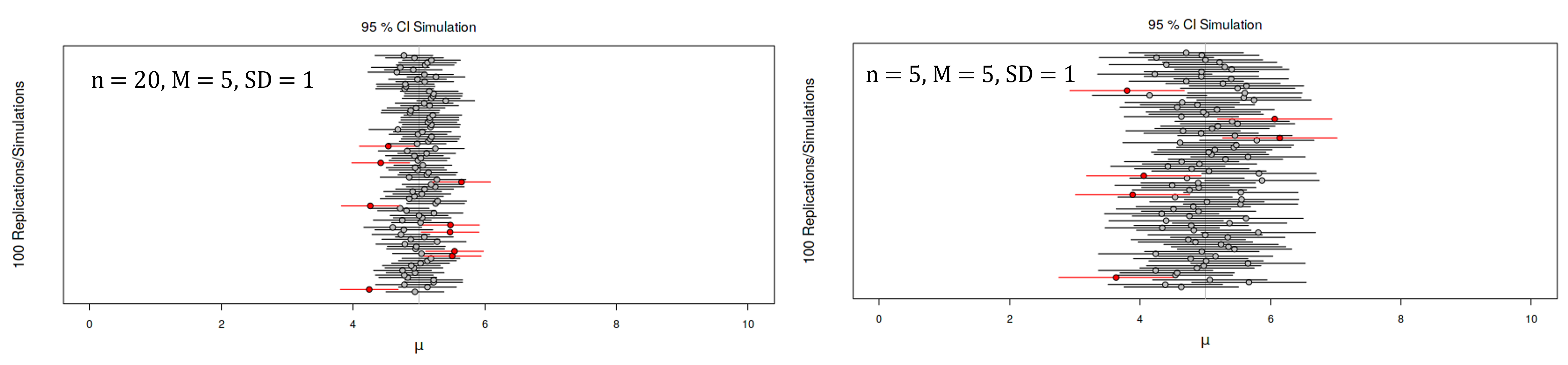
As you can see below, for every simulated sample a confidence interval is calculated, and it is centered around the mean of that specific simulated sample. The width of the confidence interval is depicted by the horizontal lines. When this interval covers the actual population mean (represented by the solid vertical line), it is displayed as a black line. On the other hand, if the interval fails to encompass the true population mean, it is represented as a red line. As you can see in Figure 6.6.1, there are times when the interval fails to encompass the true population mean.
If you change the sample size to be smaller and keep the same population parameters (i.e., same M and SD), you will see that the confidence intervals widen. This depicts the uncertainty that is associated with smaller sample sizes. Because the standard error decreases with sample size, the confidence interval should get narrower as the sample size increases (and wider as the sample size decreases), providing progressively tighter bounds on our estimate.
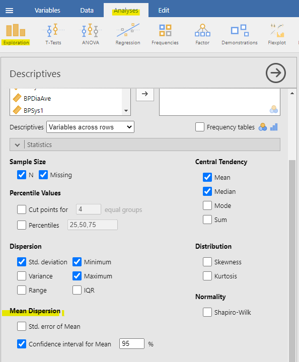
Due to modern computing, we can just let our statistical software do the heavy lifting for us. In jamovi, you can find the confidence interval for the Mean under Analyses > Exploration > Mean Dispersion. Jamovi has confidence interval options for other parameters such as mean difference and model coefficients for regression (we will talk more about this later).
Relation of Confidence Intervals to Hypothesis Tests
There is a close relationship between confidence intervals and hypothesis tests. In particular, if the confidence interval does not include the null hypothesis, then the associated statistical test would be statistically significant. For example, if you are testing whether the mean of a sample is greater than zero with  , you could simply check to see whether zero is contained within the 95% confidence interval for the mean.
Things get trickier if we want to compare the means of two conditions or more (Schenker & Gentleman 2001).[3] In certain situations, statistical analysis is conducted by comparing the confidence intervals of the estimates to determine if there is any overlap. When the confidence intervals do not overlap, this is interpreted as indicating a statistically significant difference (as shown in Figure 6.6.3). It is generally accepted that non-overlapping confidence intervals signify statistical significance, but it’s important to note that the reverse is not always true for overlapping confidence intervals (as depicted in Figure 6.6.3). For instance, what about the case where the confidence intervals overlap one another but don’t contain the means for the other group? In this case, the answer depends on the relative variability of the two variables, and there is no general answer. To obtain a more precise assessment, an alternative method involves calculating the ratio or difference between the two estimates and constructing a test or confidence interval based on that particular statistic.
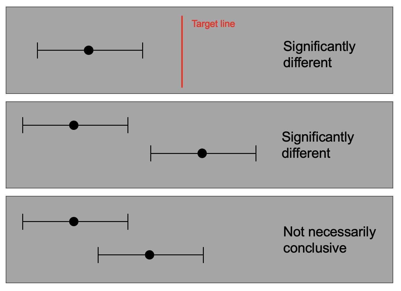
While some academics suggest avoiding the “eyeball test” for overlapping confidence intervals (e.g., Poldrack, 2023), academics like Geoff Cummings are a strong advocate for using confidence intervals instead of NHST. [4]
Effect Sizes
Statistical significance is the least interesting thing about the results. You should describe the results in terms of measures of magnitude – not just, does a treatment affect people, but how much does it affect them. (Gene Glass, cited in Sullivan & Feinn 2012).[5]
In the previous section, we discussed the idea that statistical significance may not necessarily reflect practical significance. In order to discuss practical significance, we need a standard way to describe the size of an effect in terms of the actual data, which we refer to as an effect size. In this section, we will introduce the concept and discuss various ways that effect sizes can be calculated.
An effect size is a standardised measurement that compares the size of some statistical effect to a reference quantity, such as the variability of the statistic. In some fields of science and engineering, this idea is referred to as a “signal to noise ratio”. There are many different ways that the effect size can be quantified, which depend on the nature of the data.
Cohen’s d
One of the most common measures of effect size is known as Cohen’s d, named after the statistician Jacob Cohen (who is most famous for his 1994 paper titled “The Earth is Round (p < .05)”)[6]. It is used to quantify the difference between two means, in terms of their standard deviation:

where M1 and M2 are the means of the two groups, and Spooled is the pooled standard deviation (which is a combination of the standard deviations for the two samples, weighted by their sample sizes). Note that this is very similar in spirit to the t statistic – the main difference is that the denominator in the t statistic is based on the standard error of the mean, whereas the denominator in Cohen’s d is based on the standard deviation of the data. This means that while the t statistic will grow as the sample size gets larger, the value of Cohen’s d will remain the same.
Table 6.6.1. Interpretation of Cohen’s D
| D | Interpretation |
|---|---|
| 0.0 – 0.2 | negligible |
| 0.2 – 0.5 | small |
| 0.5 – 0.8 | medium |
| > 0.8 | large |
Table 6.6.1 shows the commonly used interpretation for Cohen’s d. It can be useful to look at some commonly understood effects to help understand these interpretations. For example, the effect size for gender differences in adults’ height is d = 2.01. According to the table above, this is a very large effect. We can also see this by looking at the distributions of male and female heights in a sample from the NHANES dataset. Figure 6.6.4 shows that the two distributions are quite well separated, though still overlapping, highlighting the fact that even when there is a very large effect size for the difference between two groups, there will be individuals from each group that are more like the other group.
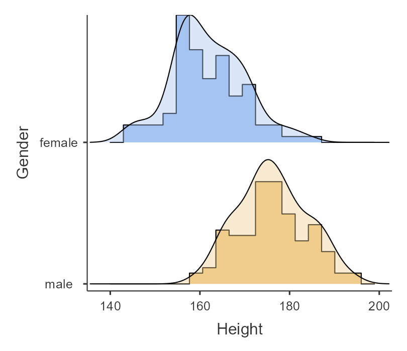
It is also worth noting that we rarely encounter effects of this magnitude in science, in part because they are such obvious effects that we don’t need scientific research to find them. Very large reported effects in scientific research often reflect the use of questionable research practices rather than truly huge effects in nature. It is also worth noting that even for such a huge effect, the two distributions still overlap – there will be some females who are taller than the average male, and vice versa. For most interesting scientific effects, the degree of overlap will be much greater, so we shouldn’t immediately jump to strong conclusions about individuals from different populations based on even a large effect size.
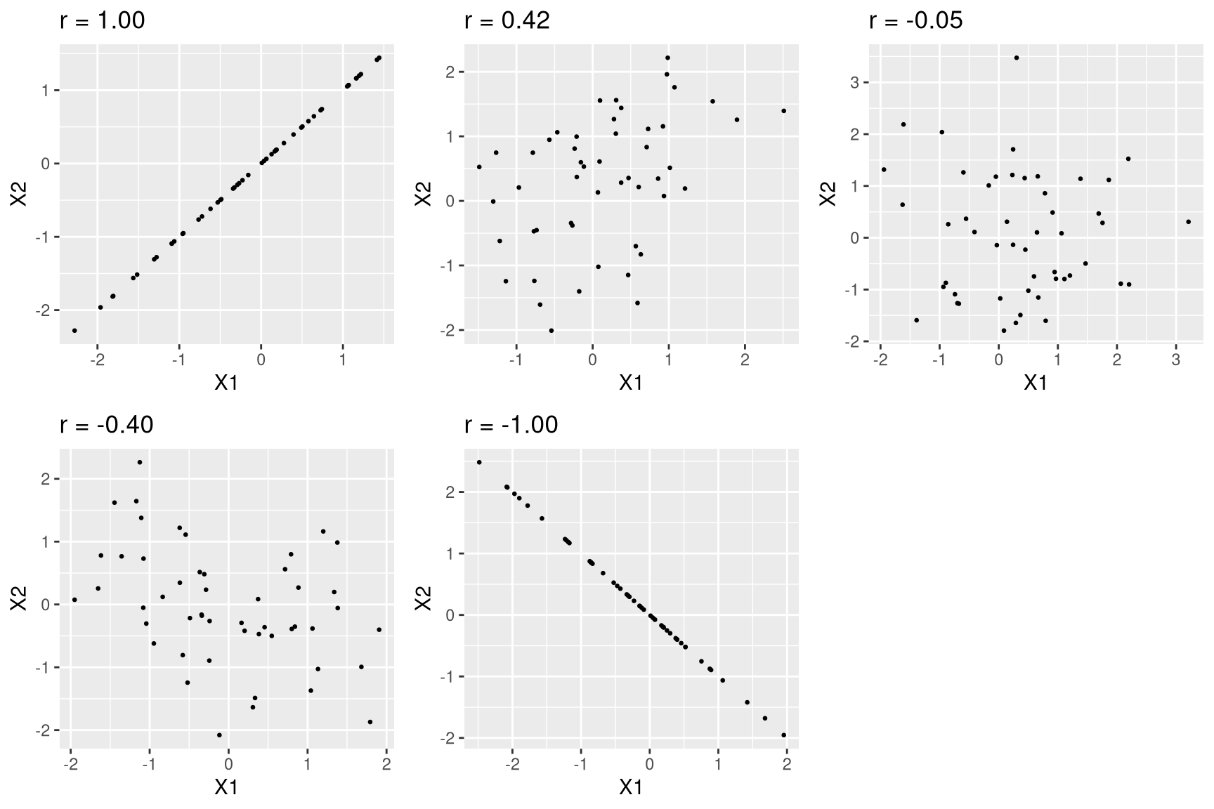
Pearson’s r
Pearson’s r, also known as the correlation coefficient, is a measure of the strength of the linear relationship between two continuous variables. We will discuss correlation in much more detail in the later chapters, therefore, we simply introduce r as a way to quantify the relation between two variables.
Pearson’s r is a measure that varies from -1 to 1, where a value of 1 represents a perfect positive relationship between the variables, 0 represents no relationship, and -1 represents a perfect negative relationship. Figure 6.6.5 shows examples of various levels of correlation using randomly generated data.
Odds ratio
In our earlier discussion of probability, we discussed the concept of odds – that is, the relative likelihood of some event happening versus not happening:

Odds ratio is simply the ratio of two odds. The odds ratio is a useful way to describe effect sizes for binary variables.
Statistical Power
Previously, we discussed the ideas of false positives (aka Type I error) and false negatives (aka Type II error). People often focus heavily on Type I error, because making a false positive claim is generally viewed as a very bad thing; for example, the now discredited claims by Wakefield (1999)[7] that autism was associated with vaccination led to anti-vaccine sentiment that has resulted in substantial increases in childhood diseases such as measles. Similarly, we don’t want to claim that a drug cures a disease if it really doesn’t. That’s why the tolerance for Type I errors is generally set fairly low, usually at . But what about Type II errors?
The concept of statistical power is the complement of Type II error – that is, it is the likelihood of finding a positive result given that it exists: power = 1-
In addition to specifying the acceptable levels of Type I and Type II errors, we also have to describe a specific alternative hypothesis – that is, what is the size of the effect that we wish to detect? Because will differ depending on the size of the effect we are trying to detect.
There are three factors that can affect statistical power:
- sample size: Larger samples provide greater statistical power
- effect size: A given design will always have greater power to find a large effect than a small effect (because finding large effects is easier)
- type I error rate: There is a relationship between Type I error and power such that (all else being equal) decreasing Type I error will also decrease power.
We can see this through simulation. First let’s simulate a single experiment, in which we compare the means of two groups using a standard t-test. We will vary the size of the effect (specified in terms of Cohen’s d), the Type I error rate, and the sample size, and for each of these we will examine how the proportion of significant results (i.e. power) is affected. Figure 6.6.6 shows an example of how power changes as a function of these factors.
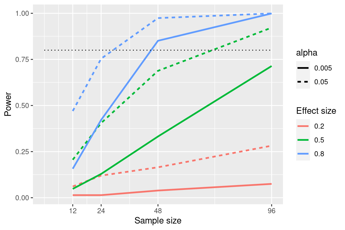
This simulation shows us that even with a sample size of 96, we will have relatively little power to find a small effect (d=0.2) with =0.005. This means that a study designed to do this would be futile – that is, it is almost guaranteed to find nothing even if a true effect of that size exists.
There are at least two important reasons to care about statistical power. First, if you are a researcher, you probably don’t want to spend your time doing futile experiments. Running an underpowered study is essentially futile because it means that there is a very low likelihood that one will find an effect, even if it exists. Second, it turns out that any positive findings that come from an underpowered study are more likely to be false compared to a well-powered study.
Power Analysis
Fortunately, there are tools available that allow us to determine the statistical power of an experiment. The most common use of these tools is in planning an experiment (i.e., a priori power analysis), when we would like to determine how large our sample needs to be to have sufficient power to find our effect of interest. We can also use power analysis to test for sensitivity. In order words, a priori power analysis answers the question, “How many participants do I need to detect a given effect size?” and sensitivity power analysis answers the question, “What effect sizes can I detect with a given sample size?”
In jamovi, a module called jpower allows users to conduct power analysis when conducting an independent samples t test, paired samples t test and one sample t test. This module is a good start – however, if you need another software that can accommodate other statistical tests, G*Power is one of the most commonly used tools for power analysis. You can find the latest version using this link.
Chapter attribution
This chapter contains material taken and adapted from Statistical thinking for the 21st Century by Russell A. Poldrack, used under a CC BY-NC 4.0 licence.
Screenshots from the jamovi program. The jamovi project (V 2.2.5) is used under the AGPL3 licence.
- Neyman, J. 1937. Outline of a theory of statistical estimation based on the classical theory of probability. Philosophical Transactions of the Royal Society of London A: Mathematical, Physical and Engineering Sciences 236(767), 333–80. https://doi.org/10.1098/rsta.1937.0005 ↵
- https://shiny.rit.albany.edu/stat/confidence/ ↵
- Schenker, N., & Gentleman J. F. 2001. On judging the significance of differences by examining the overlap between confidence intervals. The American Statistician, 55(3), 182–86. http://www.jstor.org/stable/2685796 ↵
- Cumming, G. (2014). The new statistics: Why and how. Psychological Science, 25(1), 7-29. https://doi.org/10.1177/0956797613504966 ↵
- Sullivan, G. M., & Feinn, R. (2012). Using effect size-or why the p value Is not enough. Journal of Graduate Medical Education, 4(3), 279–282. https://doi.org/10.4300/JGME-D-12-00156.1 ↵
- Cohen, J. (1994). The earth is round (p< 0.05). American Psychologist, 49(12), 997. ↵
- Wakefield, A. J. (1999). MMR vaccination and autism. The Lancet, 354(9182), 949–950. https://doi.org/10.1016/S0140-6736(05)75696-8 ↵
