6.2 Statistical Modelling Using a Single Number
Below is another way that we can represent the model that you saw in the previous chapter:


expresses the idea that the data can be broken into two portions: one portion that is described by a statistical model (the values that we expect the data to take, given our knowledge), and the other portion is error – the difference between the model’s predictions and the observed data. In this section, we will start learning about statistical modelling using a single number.
Modelling Height Using a Single Number
Before reading on, prepare the datafile in jamovi by doing the exercise below:
jamovi exercise
We will use another dataset for the following example. The American National Health and Nutrition Examination Survey data set contains data on scores of variables. The data available is equivalent to a “a simple random sample from the American population” (Pruim 2015).[1]
In total, 10,000 observations on scores of variables are available (from the 2009/2010 and the 2011/2012 surveys). For our example in this section, we will try to build a model of the height of children in the NHANES dataset. First, let’s load the data and plot them. The data can be downloaded from this link. [2]
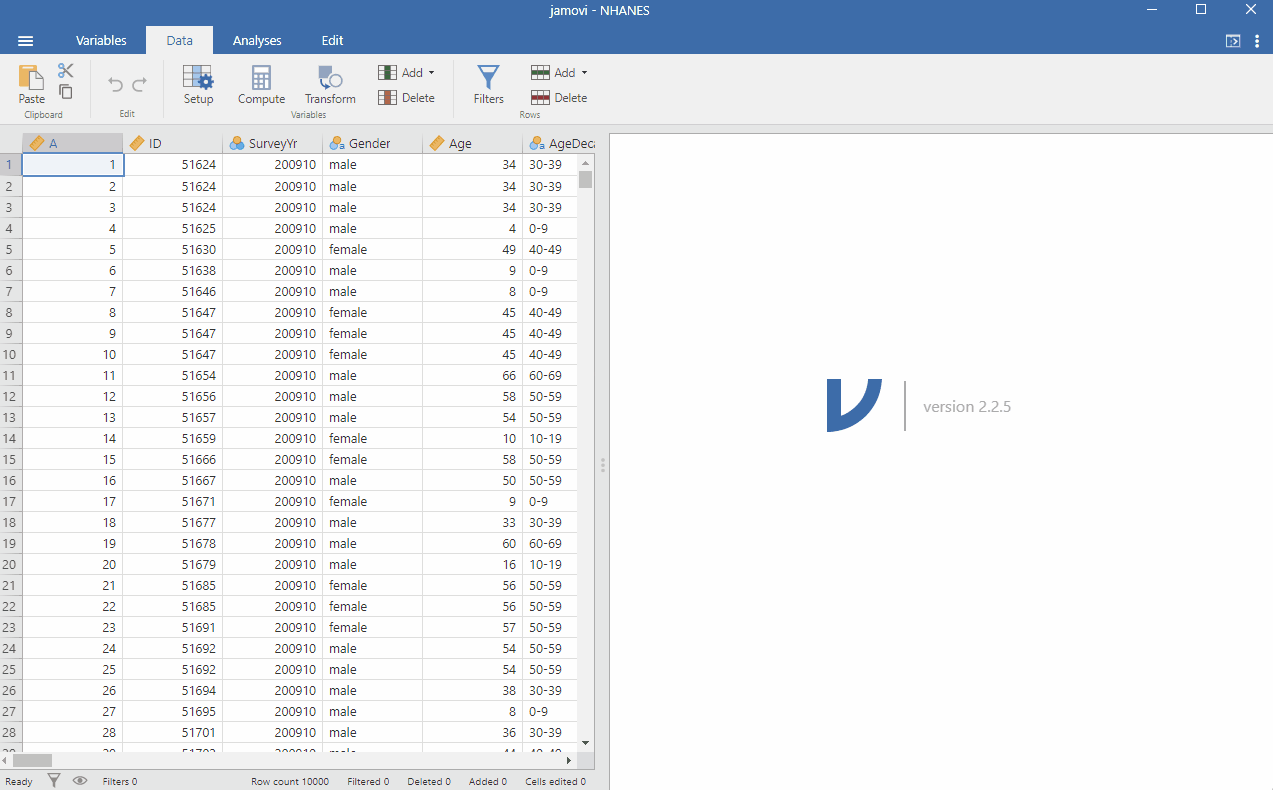
Since the data includes all participants, not just children, we will use the filter function to conduct our analysis on those aged under 18. We do this by going to Data > Filter and typing next to the function button Age < 18 and clicking somewhere in the window for the filter to take effect. To make it clearer for future analysis, you can write in the description: Filter for those under 18. You can see that the filter works when you see that some rows will be greyed out. Specifically, rows, where the participants were aged over 18, are not selected. See the image below to follow the procedure.
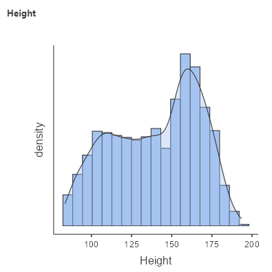
As mentioned in the previous chapter, we always want to visualise the data to see what’s going on. So, let’s create a distribution by going to Analyses > Exploration > put Height under Variable. Under Plots, check Histogram and Density. You should get the following graph:
As discussed previously, we use models to describe and communicate our data in a simple way. If we want to communicate the results of the height of children gathered from the NHANES dataset, we wouldn’t just report this with an excel spreadsheet of 2,223 datapoints and say: “here you go!”.
Remember that we want to describe the data as simply as possible while still capturing their important features. The simplest model that we can imagine would involve only a single number.
Statistical Lingo – Parameters
Whenever there are tricky concepts that I think readers may just gloss their eyes over, I’ll put the text in a separate box. The information on these white boxes are not essential to have an overall grasp of the concepts discussed, but they are useful in understanding the nuances.
In statistics, we generally describe a model in terms of its parameters. Parameters, in this instance, is just a fancy name to denote a numerical value that we can change in order to modify the predictions of the model. In this book and in other statistical texts, we refer to these using the Greek letter beta  . When the model has more than one parameter, we will use subscripted numbers to denote the different betas for example: (
 ).
).
It is also customary to refer to the values of the data using the letter  , and to use a subscripted version
  (and so on) to refer to the individual observations.
We generally don’t know the true values of the parameters, so we have to estimate them from the data. For this reason, we will generally put a “hat” over the  symbol to denote that we are using an estimate of the parameter value rather than its true value (which we generally don’t know).
So, how do we create a simple model to describe the data as simply as possible? One very simple estimator that we might imagine is the mode, which you have learnt, is the most common value in the dataset. This redescribes the entire set of 2,223 children in our data in terms of a single number. If we wanted to predict the height of any new children, then our predicted value would be the same number:
Using the word equation: 
More specific equation: 
So in other words, if we were to get a new participant under 18 and ask for their height, based on our model, we predict that this new participant will have a height of 166.5 cm.
But anyone who has been around children would know that this is not the best estimate. I, for one, have a height of 153 cm. While Filipinos are generally shorter than the average Americans[3] (the data is based on American heights), this may not be the best model.
So, How Good of a Model is This?
In general, we define the goodness of a model in terms of the magnitude of the error, which represents the degree to which the data diverges from the model’s predictions. All things being equal, the model that produces lower error is the better model (though as we will see later, all things are usually not equal…).
We can actually calculate this error using the formula below. The error for each individual is the difference between the predicted value  and their actual height
  :
:
Using the word equation: 
More specific equation: 
Using the calculation above, the average child has a fairly large error of -28.4 centimeters when we use the mode as our estimator for our model parameter. This does not seem very good on its face value. You can calculate this yourself in jamovi by creating a computed variable using the formula, 166.5 – Height. Then use Explore to look at the average error rate.
Using the Mean as the Model
How might we find a better estimator for our model parameter?
We might start by trying to find an estimator that gives us an average error of zero. One good candidate is the mean. As previously discussed, we use the mean to measure the “central tendency” of a dataset – that is, what value the data is centered around? Most people don’t think of computing a mean as fitting a model to data. However, that’s exactly what we are doing when we compute the mean.
It turns out that if we use the mean as our estimator then the total average error will indeed be zero. You can calculate this yourself in jamovi by creating a computed variable using the formula: Average height – Individual height. In other words 137.5 – Individual height. Then use Explore to look at the average error rate. If you create a new variable in jamovi with the error from the mean, you will that there is some degree of error for each individual score – some are positive, some are negative. These will cancel each other out to give an average error of zero.
We want to take into account the magnitude of the error, regardless of its direction. In other words, we want to ignore the positive and negative aspects of the error. A common way to summarise errors to take account of their magnitude is to square the errors. If we take the average of the squared errors from the mean, instead of getting zero, we will get the value of 724.24.
There are several ways to summarise the squared error, but they all relate to each other. First, we could simply add them up – this is referred to as the sum of squared errors (SSE). The magnitude of errors from this method relies heavily on the number of data points. So it can be difficult to interpret unless we are looking at the same number of observations. Second, we could take the average rate of the squared error values. This is referred to as the mean squared error (MSE). However, because we squared the values before averaging, they are not on the same scale as the original data. For the height example we have above, the new scale would be  . For this reason, it’s also common to take the square root of the MSE, which we refer to as the root mean squared error (RMSE), so that the error is measured in the same units as the original values (in this example, centimetres).
So, what can we do with this information? One way we can do this is to calculate the RMSE if we used the mode as an estimator and compare it to the RMSE if we used the mean as an estimator. The RMSE from the mode is 39.42 compared to the RMSE from the mean which is 26.91. The mean still has a substantial amount of error, but it’s much better than the mode.
When is the Mode Most Useful as a Model?
As mentioned in the last chapter, the mode represents the value that occurs most frequently. The mode is most useful when we wish to describe the central tendency of a dataset that is not numeric. In other words, the mode is most meaningful when applied to values that are discrete in nature (for instance, the count of children or the frequency of past arrests) and when dealing with categorical variables (such as gender or political affiliation).
The Beauty of Sums of Squares
As mentioned above, the sum of squared errors (most commonly known as the sum of squares) is one way to summarise the squared error. The sum of squares is a measure of how much variability or spread there is in a set of data. This concept is something you’ll see over and over again in statistics. Therefore, this is an important concept to understand.
How we do calculate the sum of squares? We take each person’s height, subtract the average height from it, and square the result. Then you add up all those squared differences. The resulting number is the sum of squares. See the equation below – notice that we just added a few bits and pieces to the error equation presented above.
Using the word equation: 
More specific equation: 
So what does this tell us? The sum of squares is a measure of how much variation there is in the heights of the group. If everyone is exactly the same height, the sum of squares will be zero. But if there is a lot of variation in heights, the sum of squares will be larger.
Why is this useful? Well, in statistical modelling, we often want to know how much of the variation in a set of data can be explained by another variable. For example, if we’re trying to predict someone’s weight based on their height, we might want to know how much of the variation in weight can be explained by height. We can use the sum of squares to help us answer this question.
By comparing the sum of squares for different variables, we can see which variable explains the most variation in the data. This can help us build better models and make better predictions.
The Dark Side of the Mean
The minimisation of SSE is a good feature, and it’s why the mean is the most commonly used statistic to summarise data. However, the mean also has a dark side. As explained in the previous chapter, the mean is highly sensitive to extreme values, which is why it’s always important to ensure that there are no extreme values when using the mean to summarise data.
Summarising Data Robustly Using the Median
If we want to summarise the data in a way that is less sensitive to outliers, we can use the median to do so. While the mean minimises the sum of squared errors, the median minimises a slightly different quantity: The sum of the absolute value of errors. This explains why it is less sensitive to outliers – squaring is going to exacerbate the effect of large errors compared to taking the absolute value.
In saying this however, mean is still regarded as an overall “best” estimator in the sense that it will vary less from sample to sample compared to other estimators. It’s up to us to decide whether that is worth the sensitivity to potential outliers – statistics is all about tradeoffs.
Chapter attribution
This chapter contains material taken and adapted from Statistical thinking for the 21st Century by Russell A. Poldrack, used under a CC BY-NC 4.0 licence.
Screenshots from the jamovi program. The jamovi project (V 2.2.5) is used under the AGPL3 licence.
- Pruim, Randall. 2015. NHANES: Data from the US National Health and Nutrition Examination Study. https://CRAN.R-project.org/package=NHANES. ↵
- The original data set is sourced from https://bookdown.org/pkaldunn/DataFiles/NHANES.html#ref-data:NHANES:Rpackage ↵
- see https://en.wikipedia.org/wiki/Average_human_height_by_country ↵
