5.3 Summarising Data Using Graphs
Above all else show the data.
– Edward Tufte[1]
How data visualisations can help solve crimes
Harold Shipman, one of the UK’s most prolific serial killers, was charged with 15 counts of murder in 2000 for individuals under his care as a general practitioner. It is strongly suspected, however, that he was responsible for an estimated total of 250 deaths between 1975 and 1998. His crimes came to light in 1998 when concerns were raised about the high death rate among his patients, particularly the elderly. Investigations revealed that Shipman administered lethal quantities of morphine to his patients.[2]
David Spiegelhalter wrote a wonderful book called The Art of Statistics and argued that statistics could have helped catch Shipman earlier. Here is one of the figures presented from the book (recreated using the jamovi R module and the dataset from The Art of Statistics GitHub repository).

Figure 5.3.1 shows a line graph that illustrates the time of day when Shipman’s patients died (represented by a solid line) in contrast to the times of death among a sample of patients treated by other local GPs (represented by a broken line). As you can see in the figure, the majority of Shipman’s patients tended to pass away during the early afternoon hours. According to Spiegelhalter, the data itself doesn’t provide an explanation for this pattern, however, a deeper inquiry into his practices uncovered that he conducted his home visits post-lunch, a time when he was typically alone with his elderly patients.
Why do we Need to Visualise Data?
The above story is pretty grim. However, I hope that you can see the importance of data visualisation from reading the story. Visualising data is one of the most important tasks facing the data analyst. It’s important for two distinct but closely related reasons. Firstly, there’s the matter of drawing “presentation graphics” – displaying your data in a clean and visually appealing fashion makes it easier for your reader to understand what you’re trying to tell them. Equally important, perhaps even more important, is the fact that drawing graphs helps you to understand the data. To that end, it’s important to draw “exploratory graphics” that help you learn about the data as you go about analysing it. These points might seem pretty obvious but I cannot count the number of times I’ve seen people forget them.
Plotting Frequencies
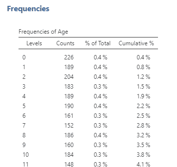
In addition to creating tables to look at frequency, we can also plot them in a graph. Now let’s look at another type of variable: Age. Since age is a continuous variable – and in this dataset, we have ages from 0 to 101 – this time, it wouldn’t make sense to put them in a frequency table. If we do, it will create a really long table with all available ages in the dataset (see Figure 5.3.2 for what happens when I graphed age in a frequency table).
Instead, we will plot age using histograms, density plots and violin plots. First, let’s plot the age variable for all of the individuals in the crash_data_ardd.csv dataset using histograms (see Figure 5.3.3-A). Histograms use bars to display the frequency of values in a dataset within specified ranges (or bins). It is not clear what range is used below, but we can assume that the ranges used were 0-5, 5-10, 10-15, and so on.[3] From the figure above, you may notice a large spike in deaths at around age 20-25.
We can ask jamovi to add a density plot to your histogram. A density plot depicts the data distribution with a smooth curve representing the proportion of values in each range. In essence, a histogram shows value counts in ranges with bars, while a density plot presents a continuous distribution curve. The spike is clearer with the density plot (Figure 5.3.3-B), but another visualisation may be useful here.
Let’s ask jamovi to instead create a violin plot (Figure 5.3.3-C). This spike is clearer in the violin plot. There is a higher density of crashes just below the age of 25. What do you think that spike is about?
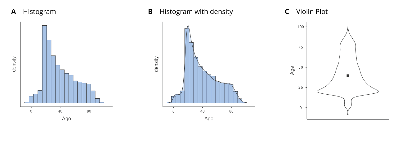
According to the Bureau of Infrastructure, Transport and Regional Economics (BITRE),[4] around 20% of 1 in 5 individuals who are killed on the road were aged 17 to 25 years. Our violin plot clearly shows this.
We will later discuss more ways that we can visualise data, but violin plots (along with density plots) visualise the distribution of data over a continuous interval or time period. These plots are especially useful when we want to make a comparison of distributions between multiple groups. The peaks, valleys and tails of each group’s density curve can be compared to see where groups are similar or different.
Anatomy of a Plot
The goal of plotting data is to present a summary of a dataset in a two-dimensional (or occasionally three-dimensional) presentation. We refer to the dimensions as axes – the horizontal axis is called the X-axis and the vertical axis is called the Y-axis. A mnemonic that helps me to differentiate the two is: “x is across, y to the sky”.
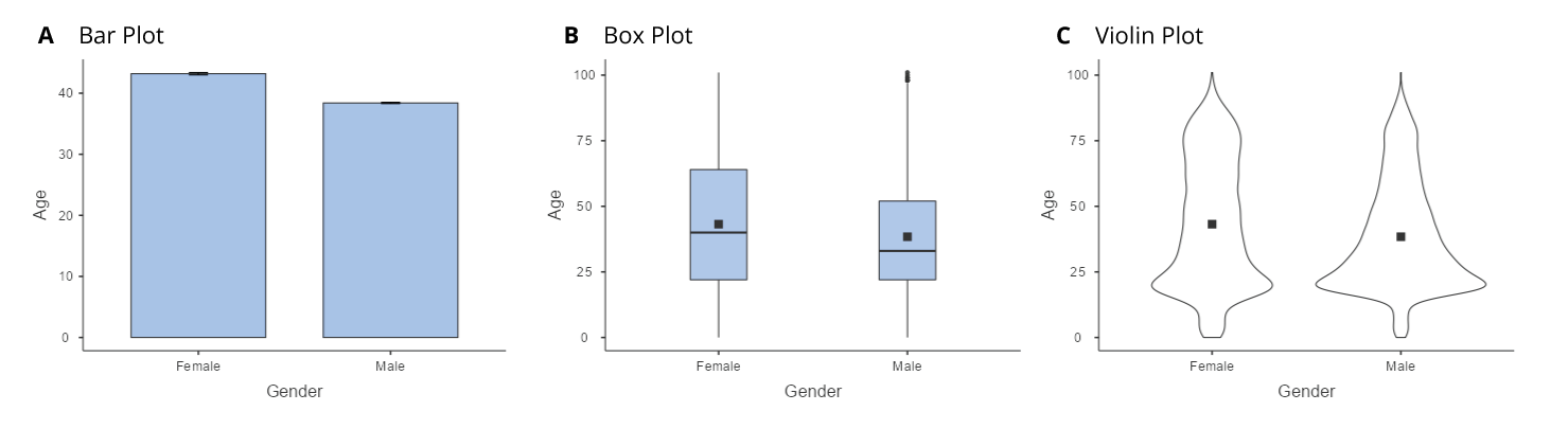
We can arrange the data along the axes in a way that highlights the data values. These values may be either continuous or categorical. There are many different types of plots that we can use, which have different advantages and disadvantages. Let’s say that we are interested in characterising the difference in ages of men and women in the ARDD dataset. Figure 5.3.4 shows three different ways to plot these data and we will cover each one below.
Bar Graphs
The bar graph in panel A shows the difference in means, but doesn’t show us how much spread there is in the data around these means. As we will see later, knowing this is essential to determine whether we think the difference between the groups is large enough to be important.
Box Plots and Violins
Another option is the box plot shown in panel B, which shows the median (central line), a measure of variability (the width of the box, which is based on a measure called the interquartile range), and any outliers (noted by the points at the ends of the lines). Since the box plot automatically separates out those observations that lie outside a certain range (depicting them with a dot in jamovi) people often use them as an informal method for detecting outliers: observations that are “suspiciously” distant from the rest of the data.
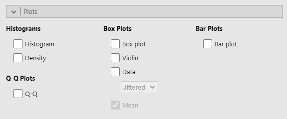
In panel C, we see one example of a violin plot, which plots the distribution of data in each condition. Violin plots are similar to box plots except that they also show the kernel probability density of the data at different values. Typically, violin plots will include a marker for the median of the data and a box indicating the interquartile range, as in standard box plots. In jamovi you can achieve this sort of functionality by checking both the “Violin” and the “Box plot” checkboxes. You can also turn on “Data” to show the actual data points on the plot. This does tend to make the graph a bit too busy, in my opinion. Clarity is simplicity, so in practice, it might be better to just use a simple box plot.
In general, we prefer box plots and violins as plotting techniques as they provide a clearer view of the distribution of the data points.
Learning how to draw graphs in jamovi is reasonably simple as long as you’re not too picky about what your graph looks like. Figure 5.3.5 below shows the different plots currently available in jamovi. In jamovi there are a lot of very good default graphs, or plots, that most of the time produce a clean, high-quality graphic. However, on those occasions when you do want to do something non-standard, or if you need to make highly specific changes to the figure, then the base graphics functionality in jamovi is not yet capable of supporting advanced work or detail editing. Instead, you will need to install other modules in jamovi for other graphing functionalities.
Given that jamovi is limited in its capacity for detail editing, I won’t delve deep into the principles of good visualisation. However, if you’d like to know about how to make effective visualisations, I suggest the following readings:
- Poldrack, R. (2022). Principles of good visualization. In Statistical thinking in the 21st century. https://statsthinking21.github.io/statsthinking21-core-site/data-visualization.html#principles-of-good-visualization (this is an open textbook!)
- Knaflic, C. N. (2015). Storytelling with data. Wiley. https://onlinelibrary.wiley.com/doi/book/10.1002/9781119055259
Chapter attribution
This chapter contains taken and adapted material from Learning statistics with jamovi by Danielle J. Navarro and David R. Foxcroft, used under a CC BY-SA 4.0 licence.
Screenshots from the jamovi program. The jamovi project (V 2.2.5) is used under the AGPL3 licence.
- Tufte, E. R. (1983). The visual display of quantitative information. Graphics Press. ↵
- https://en.wikipedia.org/wiki/Harold_Shipman ↵
- This is one of the limitations of jamovi. ↵
- Bureau of Infrastructure and Transport Research Economics (2021). Road trauma Australia 2021 statistical summary. https://www.bitre.gov.au/sites/default/files/documents/road_trauma_2021.pdf ↵
