5.2 Summarising Data Using Tables
A simple way to summarise data is to generate a table representing counts of various types of observations. This type of table has been used for thousands of years (see Figure 5.2.1).

Let’s look at some examples of the use of tables. We will use the crash_data_ardd.csv dataset. This dataset is collected by the Australian Road Deaths Database (ARDD) which provides basic information on fatalities resulting from road transport crash fatalities in Australia as reported monthly by the police to state and territorial road safety authorities. Data is available from 1989 to 2021. It’s a large dataset! If you scroll through the data, you will see that there are 52,843 entries in this dataset representing 52,843 casualties between 1989 to 2021.
Within this dataset, there’s a variable named Dayweek, which represents the day of the week the casualty occurred. We can make more sense of the data by creating a frequency table. Doing so will group the data by the different values of the variable, and then count how many values there are in each group:
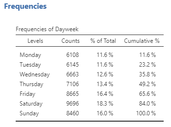
This table shows the frequencies of each of the different values. Between 1989 and 2021, there were 6,108 casualties recorded on a Monday, 6,145 casualties on a Tuesday and so on. By looking at the counts, we can tell that the highest number of casualties occurred on Saturday. However, it can be hard to tell from absolute numbers how big the difference is. For this reason, we would often present the data using percentages. In the table above, % of Total shows how many casualties occurred on each weekday by percentages. From here, we can see that 18.3% of the casualties occurred on a Saturday.
Note that jamovi also calculates the cumulative percentage (which adds the percentages of each value from the top of the table to the bottom). It’s not a particularly useful statistic if you are more interested in the specific percentage per category. In our example above, the more interesting information you can get from the cumulative percentage is that 65.6% of the casualties occurred in during the weekday.
Cumulative percentage is more useful when the variable of analysis is ranked or ordinal, as it makes it easy to get a sense of what percentage of cases fall below (or above) each rank. I also think the cumulative percentage is more meaningful if it’s presented as a graph.[1]
Jamovi Exercises – Frequency Table
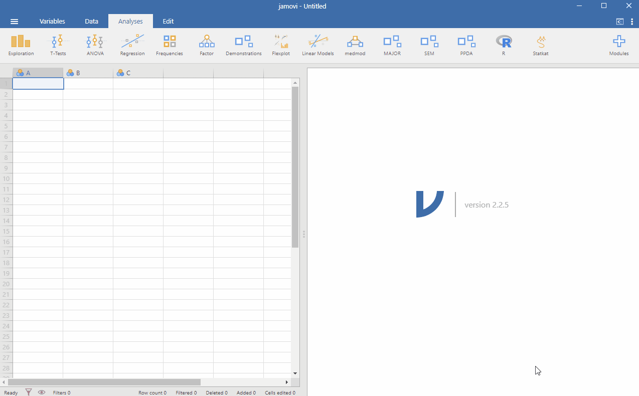
Create a frequency table in jamovi from the crash_data_ardd.csv dataset. You can do this by opening the file into jamovi. Go to Analyses > Exploration. Check Frequency Tables. Put the variables you are interested in under the Variables window. See below:
- Recreate the frequency table above for Dayweek variable.
- Create a new frequency table for Gender. From your frequency table, what percentage of men are involved in the casualties?
Chapter attribution
Screenshots from the jamovi program. The jamovi project (V 2.2.5) is used under the AGPL3 licence.
- See this wonderful interactive graph showing the Cumulative confirmed COVID-19 cases by world region from Our World in Data: https://ourworldindata.org/grapher/cumulative-covid-cases-region ↵
