7.2 Modelling Continuous Relationships
Let’s say you’re on the beach and you witnessed that every time the ice cream truck shows up, the number of people at the beach increases. Now, instinctively, you might notice a connection between these two things. In this section, we will talk about how can use statistics to help us figure out if there’s a relationship between variables on a continuous scale.
Covariation and Correlation
One way to quantify the relationship between two variables is the covariance. Remember that variance for a single variable is computed as the average squared difference between each data point and the mean. Covariance tells us to which extent two variables change together. In simpler terms, it helps us understand whether, when one variable goes up, the other tends to go up or down. A positive covariance suggests that the variables move in the same direction, while a negative covariance indicates they move in opposite directions. However, the magnitude of covariance isn’t easily interpretable. Instead, we usually use the correlation coefficient (often referred to as Pearson’s correlation after the statistician Karl Pearson). The correlation coefficient is computed by scaling the covariance by the standard deviations of the two variables.
The correlation coefficient is useful because it varies between -1 and 1 regardless of the nature of the data – in fact, we already discussed the correlation coefficient earlier in our discussion of effect sizes. As we saw in that previous chapter, a correlation of 1 indicates a perfect linear relationship, a correlation of -1 indicates a perfect negative relationship and a correlation of zero indicates no linear relationship.
Hypothesis Testing for Correlations
Let’s say we wanted to see the correlation between extroversion and openness to experience using data from personalitydata.csv. If we plot the variables called extroversion and openness, we will get the following:
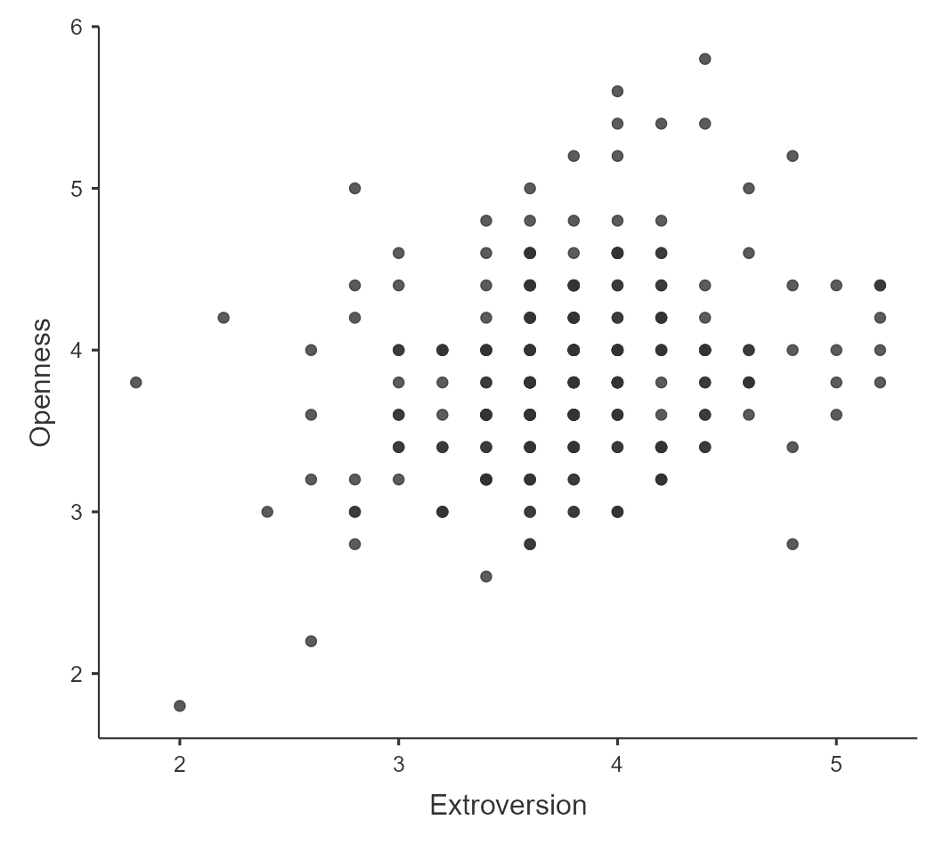
The following graph indicates a positive relationship between extroversion and openness to experience suggesting that those who are high in extroversion will also have high levels of openness to experience. We may also want to test the null hypothesis that the correlation is zero, using a simple equation that lets us convert a correlation value into a t statistic:

Under the null hypothesis H0: r = 0, this statistic is distributed as a t distribution with N − 2 degrees of freedom. We can compute this using jamovi by going to Analyses > Regression > Correlation Matrix and putting the variables for extroversion and openness into the variables window. Figure 7.2.2 shows us the results:
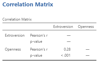
The correlation value of 0.28 between extroversion and openness to experience seems to indicate a reasonably moderate positive relationship between the two. The p-value above shows that the likelihood of an r value this extreme or more is quite low under the null hypothesis, so we would reject the null hypothesis of r = 0. Note that this test assumes that both variables are normally distributed.
Robust Correlations
You may have noticed that some of the data points in Figure 7.2.1 seemed to be quite separate from the others. We refer to them as outliers. The correlation coefficient is very sensitive to outliers. For example, in Figure 7.2.3 we can see how a single outlying data point can cause a very high positive correlation value, even when the actual relationship between the other data points is perfectly negative.
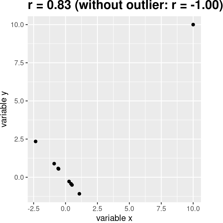
One way to address outliers is to compute the correlation on the ranks of the data after ordering them, rather than on the data themselves; this is known as the Spearman correlation. Whereas the Pearson correlation for the example above is 0.28, the Spearman correlation is 0.25, showing that the rank correlation reduces the effect of the outlier and reflects the negative relationship between the majority of the data points. Getting the Spearman correlation is really easy in jamovi, you just click this as an additional option for your results.
Correlation and Causation
When we say that one thing causes another, what do we mean? There is a long history in philosophy of discussion about the meaning of causality, but in statistics, one way that we commonly think of causation is in terms of experimental control. That is, if we think that factor X causes factor Y, then manipulating the value of X should also change the value of Y.
In medicine, there is a set of ideas known as Koch’s postulates which have historically been used to determine whether a particular organism causes a disease. The basic idea is that the organism should be present in people with the disease, and not present in those without it – thus, a treatment that eliminates the organism should also eliminate the disease. Further, infecting someone with the organism should cause them to contract the disease. An example of this was seen in the work of Dr. Barry Marshall, who had a hypothesis that stomach ulcers were caused by a bacterium (Helicobacter pylori). To demonstrate this, he infected himself with the bacterium, and soon thereafter developed severe inflammation in his stomach. He then treated himself with an antibiotic, and his stomach soon recovered. He later won the Nobel Prize in Medicine for this work.
Often we would like to test causal hypotheses but we can’t actually do an experiment, either because it’s impossible (“What is the relationship between human carbon emissions and the earth’s climate?”) or unethical (“What are the effects of severe neglect on child brain development?”). However, we can still collect data that might be relevant to those questions. For example, we can potentially collect data from children who have been neglected as well as those who have not, and we can then ask whether their brain development differs.
Let’s say that we did such an analysis, and found that neglected children had poorer brain development than non-neglected children. Would this demonstrate that neglect causes poorer brain development? No. Whenever we observe a statistical association between two variables, it is certainly possible that one of those two variables causes the other. However, it is also possible that both of the variables are being influenced by a third variable; in this example, it could be that child neglect is associated with family stress, which could also cause poorer brain development through less intellectual engagement, food stress, or many other possible avenues. The point is that a correlation between two variables generally tells us that something is probably causing something else, but it doesn’t tell us what is causing what.
Causal Graphs
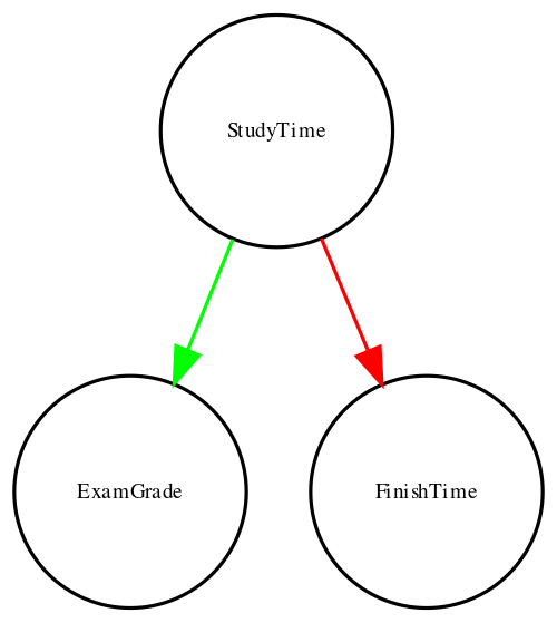
One useful way to describe causal relations between variables is through a causal graph, which shows variables as circles and causal relations between them as arrows. For example, Figure 7.2.4 shows the causal relationships between study time and two variables that we think should be affected by it: exam grades and exam finishing times.
However, in reality, the effects on finishing time and grades are not due directly to the amount of time spent studying, but rather to the amount of knowledge that the student gains by studying. We would usually say that knowledge is a latent variable – that is, we can’t measure it directly but we can see it reflected in variables that we can measure (like grades and finishing times). Figure 7.2.5 shows this:
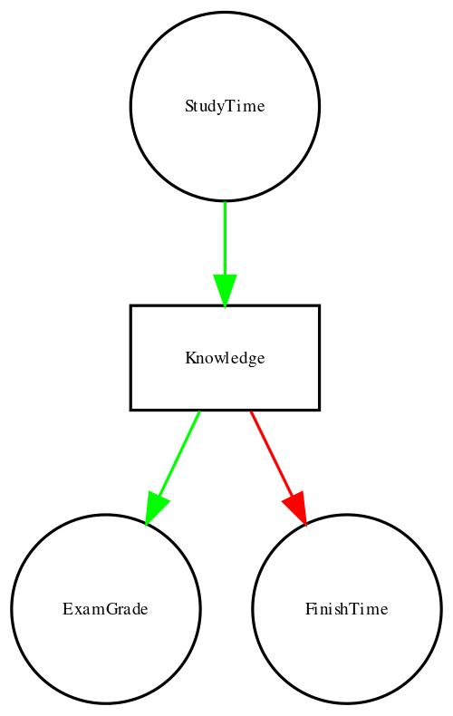
Here, we would say that knowledge mediates the relationship between study time and grades/finishing times. That means that if we were able to hold knowledge constant (for example, by administering a drug that causes immediate forgetting), then the amount of study time should no longer have an effect on grades and finishing times.
Note that if we simply measured exam grades and finishing times we would generally see a negative relationship between them because people who finish exams the fastest in general get the highest grades. However, if we were to interpret this correlation as a causal relation, this would tell us that in order to get better grades, we should actually finish the exam more quickly! This example shows how tricky the inference of causality from non-experimental data can be.
Within statistics and machine learning, there is a very active research community that is currently studying the question of when and how we can infer causal relationships from non-experimental data. However, these methods often require strong assumptions, and must generally be used with great caution.
Linear Regression
Another way that we can examine the relationship between continuous variables is by using linear regression. The term regression was coined by Francis Galton, who noted that when he compared parents and their children on some feature (such as height), the children of extreme parents (i.e. the very tall or very short parents) generally fell closer to the mean than did their parents.
In addition to having the ability to describe the relationship between two variables and to decide whether that relationship is statistically significant, linear regression also allows us to predict the value of the outcome variable given some new value(s) of the predictor variable(s). Most importantly, the general linear model will allow us to build models that incorporate multiple predictor variables, whereas the correlation coefficient can only describe the relationship between two individual variables.
The simplest version of the linear regression model (with a single independent variable) can be expressed as follows:

The value tells us how much we would expect y to change given a one-unit change in  . The intercept
  is an overall offset, which tells us what value we would expect y to have when
  ; you may remember from our early modelling discussion that this is important to model the overall magnitude of the data, even if never actually attains a value of zero. The error term
  refers to whatever is left over once the model has been fit; we often refer to these as the residuals from the model. If we want to know how to predict y (which we call
  ) after we estimate the beta values, then we can drop the error term:


Note that this is simply the equation for a line, where  is our estimate of the slope and
  is the intercept.
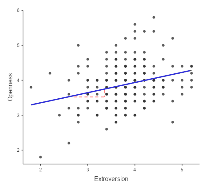
The value of the intercept is equivalent to the predicted value of the y variable when the x variable is equal to zero. The value of beta is equal to the slope of the line – that is, how much y changes for a unit change in x. This is shown schematically in the dashed lines, which show the degree of increase in openness to experience for a single unit increase in extroversion.
The relation between correlation and regression
There is a close relationship between correlation coefficients and regression coefficients. Remember that Pearson’s correlation coefficient is computed as the ratio of the covariance and the product of the standard deviations of x and y:

whereas the regression beta for x is computed as:

Based on these two equations, we can derive the relationship between  and latex]\hat{\beta}[/latex]:


That is, the regression slope is equal to the correlation value multiplied by the ratio of standard deviations of y and x. One thing this tells us is that when the standard deviations of x and y are the same (e.g. when the data have been converted to Z scores), then the correlation estimate is equal to the regression slope estimate.
Regression to the Mean
The concept of regression to the mean was one of Galton’s essential contributions to science, and it remains a critical point to understand when we interpret the results of experimental data analyses. Let’s say that we want to study the effects of a reading intervention on the performance of poor readers. To test our hypothesis, we might go into a school and recruit those individuals in the bottom 25% of the distribution on some reading test, administer the intervention, and then examine their performance on the test after the intervention. Let’s say that the intervention actually has no effect, such that reading scores for each individual are simply independent samples from a normal distribution. Results from a computer simulation of this hypothetical experiment are presented in Table 7.2.1.
Table 7.2.1. Reading scores for Test 1 (which is lower, because it was the basis for selecting the students) and Test 2 (which is higher because it was not related to Test 1).
| test | score |
| Test 1 | 88 |
| Test 2 | 101 |
If we look at the difference between the mean test performance at the first and second test, it appears that the intervention has helped these students substantially, as their scores have gone up by more than ten points on the test! However, we know that in fact the students didn’t improve at all, since in both cases the scores were simply selected from a random normal distribution. What has happened is that some students scored badly on the first test simply due to random chance. If we select just those subjects on the basis of their first test scores, they are guaranteed to move back towards the mean of the entire group on the second test, even if there is no effect of training. This is the reason that we always need an untreated control group in order to interpret any changes in performance due to an intervention; otherwise, we are likely to be tricked by regression to the mean. In addition, the participants need to be randomly assigned to the control or treatment group, so that there won’t be any systematic differences between the groups (on average).
Chapter attribution
This chapter contains material taken and adapted from Statistical thinking for the 21st Century by Russell A. Poldrack, used under a CC BY-NC 4.0 licence.
Screenshots from the jamovi program. The jamovi project (V 2.2.5) is used under the AGPL3 licence.
